
Wouldn't it be great if program developers and users shared the same knowledge base? Programs would be designed according to the tasks of the users and each would know what the other was talking about. Unfortunately, that's rarely the case, and too many programs give the impression that they were written in a different language. Here are some examples of some rather unclear program elements.
Last updated 15-December-1999
| Olli Siltanen suggested we take a look at CSE HTML Validator v3.05, a program designed to check HTML documents for syntactical errors. We found this portion of its Options dialog to be particularly problematic. |
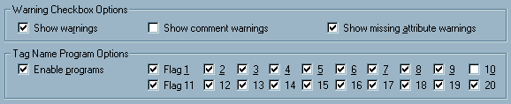
The "Flag" checkboxes are used to set validation and program options. Quick, here's a test:
Here are the answers:
Each flag controls the validation of several HTML tags; the user will have to visit the help file to determine the tags related to a particular flag. The existing design is merely a reflection of the programmer's model of the system, which in no way helps the user. The developer was concerned with making the program configurable for a variety of browsers and expandable to include changes to HTML specifications as they occur. Hey, here's an idea: if Flag 1 represents IE-Specific, why not call it something like, oh, I don't know, maybe ... IE-Specific? We offer the following as an alternative design that would benefit both the user and the developer. The alternative provides immediate access to the definition of the program settings, and allows the developer to add additional capabilities in the future without changing the design of the form or its documentation. |
 |
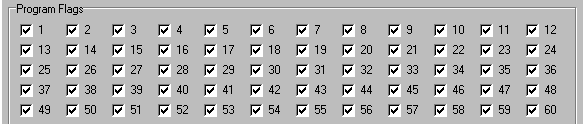
| Update 19-September-1999: in the recently released version 4.0 of CSE HTML Validator, the developers took a bad idea and made it far worse. Now rather than having to struggle with 20 flags, the user must contend with 60: |
|
| An additional change in the new version was to employ an HTML-based help file, with a navigation structure that makes it even more difficult to find explanations for the flags. |
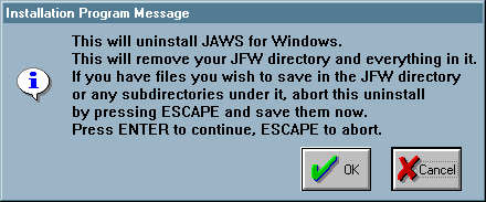 This message was generated when uninstalling JAWS, an otherwise very useful screen reading program. This simple dialog however, demonstrates a number of significant problems. Users have unfortunately become conditioned to confirmation dialogs. This particular confirmation dialog, however, requires that the user pay particular attention. When uninstalling JAWS, the contents of its directory, and any subdirectory contained in that directory are removed, whether or not the files are associated with JAWS. This is an unnecessarily dangerous operation, the consequences of which will be overlooked by the many users that have come to casually dismiss confirmation dialogs. The user that does catch the import of the message is expected to enter the file hierarchy to perform some file manipulations. "Save" is a rather inappropriate suggestion, and is likely to confuse an inexperienced user. The user must move the files and/or directories simply because the programmer chose to wipe out the directory rather than removing only appropriate files. A further problem with the dialog is that it contains an OK and a Cancel button, but the instructions refer to the ENTER and ESCAPE keys. New users are unlikely to know that the ENTER key is the equivalent of selecting the default command button, nor that the Escape key is the keyboard equivalent of selecting the Cancel command button. Moreover, if the default command button has been changed, perhaps due to an inadvertent keyboard action, the keyboard mappings are no longer appropriate. As shown in the above image, pressing the Enter key will have the effect of selecting the Cancel button. A particularly insiduous problem with the JAWS uninstall procedure is that the procedure does not remove the half-dozen entries the installation program created in the user's Start Menu. The user is forced to navigate the Windows95 file hierarchy to clean up after the lazy programmer. One is left to wonder what other items were carelessly left on the system. |
|
Alexander Lewis sent in this image of a misleading error message in Microsoft's Outlook '98:
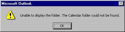 The message is generated when a user attempts to view the calendar of another individual but does not have read permissions for that calendar. The message gives the impression that there is actually something wrong with the other individual's configuration, when in fact, it's merely a permissions issue. Once the user is granted read permission to the other Calendar, the message will not appear. |
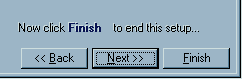 We came across this confusing instruction when installing a demo version of TransSoft Ltd.'s FTP Control (v. 3.33). The installation program uses a Wizard approach to take the user through a series of configuration screens. On the last screen, a portion of which is shown here, the user is instructed to select the Finish button, despite the fact that the dialog offers a Next button, and when the Next button is indeed the default. Our bet: most users press the Next button in spite of the instructions, only to find that doing so takes them back to the beginning of the configuration process.
|
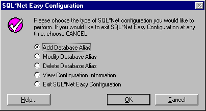 Nigel Harris sent us some images from Oracle's SQL*Net Easy Configuration utility. The image above illustrates the utility's main form. One problem is that the Cancel button does not really cancel anything; instead, it dumps the user out of the application. Close attention to the instructions on the form should reveal this: If you would like to exit SQL*Net Easy Configuration at any time, choose CANCELHere's an idea: how about labeling the Cancel button...Exit? The instructions fail to point out an alternative means of exiting the application: select the Exit option, then press OK. If Cancel really Exits, why provide the Exit option at all? The truly sad part of all this is that after hitting the Cancel button, a message box is displayed to indicate that you have ... exited the application. If you had hit the Cancel button by mistake, (or if you had intended to Cancel your last operation), you're out of the application and out of luck. The confirmation message does not allow you to Cancel the exit process. 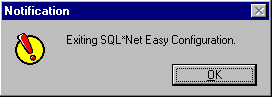 |
|
The wonders of cross-platform software:
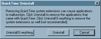 We found this curious message when uninstalling Apple's QuickTime 4.0 Player for Win95. We are told that the phrase "System Extensions" is familiar to Mac users, but the Win95 users who will see the message will justifiably be at a loss as to its meaning. Some might argue that the oversight is a reaction to the fact that Mac users have had to endure similar oversights in Microsoft products. Sylvain Martel sent us this image of an error message he received from Microsoft's Office 98 on a PowerMac when attempting to add a flow chart to a Word document. 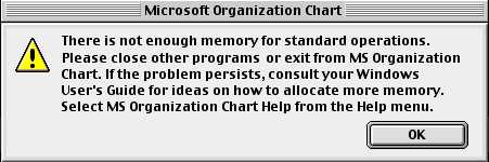 Needless to say, Sylvain had more than a little difficulty finding a Windows User's Guide among Apple's documentation. |
|
In the spirit of rewarding the many technical writers who have suggested various corrections to the site, we present this image sent to us by Stephen Ross: 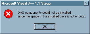 The message was displayed when Stephen attempted to install Microsoft's Visual J++ on a PC that was running low on hard disk space. It would appear that Microsoft's QA testing group never tried to install the product on a similarly overburdened PC. |
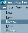 Paint Shop Pro offers a very handy Browse function that displays thumbnail images of each of the graphic images in any particular folder. A double-click on the image of interest opens the image for editing.
Unfortunately, the Browse function has one very annoying interface feature. After a Browse operation has been performed, the Browse menu item disappears; to browse a different folder, you must select "New Folder" from the File menu. Despite the fact that we've been heavy users of Paint Shop Pro for several years, this "feature" still throws us; when we want to perform a browse, we look for an item labelled ... "Browse".
|
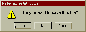 This message in Quicken's Turbo Tax will cause a great deal of uncertainty. We found it when, just after starting TurboTax, we selected the "One-Click Update" function from the Help menu, to connect to their web-site and see if any updates to the program were available. Since we had no idea of which file the message referred to, we cancelled the function. It was only after curiousity got the better of us that we attempted the update again, and said "Yes, save whatever file you're talking about" that we learned which file the message referred to. The program then presented a Save File dialog, with the title, "Save Tax Return". We found this somewhat bizarre, because we had not yet started working on a tax return; TurboTax uses a wizard-like interface, and we had not yet selected the "Let's get started" function.
As it turns out, TurboTax always starts up with a tax return in the background. Even if you attempt to exit the program without working on the return, TurboTax will display the "Save this File?" prompt, inevitably causing new users of the program to rightfully ask, "Which file?" |
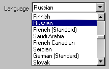 Shamil sent us an image from Windows Help Designer (Professional edition v.2.1.2) illustrating a particularly unprofessional and unhelpful ordering of items.
One would think that the developer, at some point, would have looked at his creation and realized how difficult it is to locate a particular language. Oh well... |
This message, generated during the installation of a U.S. Robotics modem, falls into the category, "Say what you mean." If the developer wanted the buttons to mean "Yes" and "No", why didn't he or she simply label them "Yes" and "No"? |
 This image from OrderWriter, one of the Big Two in sales force
automation software for the foodservice industry, was provided by visitor Lauren Eve Pomerantz:
This image from OrderWriter, one of the Big Two in sales force
automation software for the foodservice industry, was provided by visitor Lauren Eve Pomerantz:
But you knew that, right? |

At the risk of offending our many Linux visitors, we have included this example of geekspeak sent to us by visitor Paul Winkler. The message is displayed when the user attempts to exit XFM, the "X-windows File Manager". The hapless user is faced with three rather ambiguous options, leading to such questions as:
|
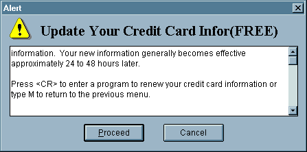
We found this interesting dialog in CompuServe's WinCim application. The dialog is presented when the user has asked to update his or her credit card information. We found the last paragraph rather indicative that the programmer was more comfortable talking with computers than he or she would be talking to computer users. Is it really necessary to inform the user that he or she would "...enter a program" to renew the information, or would not "...to renew your information" suffice. Given that the window is a simple confirmation dialog, why did the programmer decide to make it appear to be a serious error message? Is the title "Alert", accompanied by the Windows caution symbol really appropriate? While we understand that CompuServe must support a variety of platforms, we would have hoped that they would have verified that the instructions given in each version of its software would be consistent with the intended platform. We can understand the meaning of "Press <CR>" (although we would expect that the phrase might cause many of CompuServe's computer-unsophisticated users to scratch their heads), but the phrase "type M to return to the previous menu" simply does not apply to this version of the software. Typing the letter M, of course, does nothing. |
 Watcom C++ programming environment. Should we even mention the problem?
|
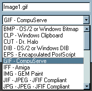
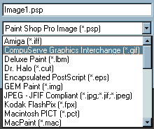 Change sucks. In their transition from version 4 to version 5 of Paint Shop Pro, the designers chose to radically change the way users interact with the program. The images above are cropped from the Save dialogs from version 4 (left) and version 5 (right). The upper field represents the default filename assigned to the image, and the lower field represents the file type. Whereas in version 4, the user that wants to save an image in .GIF format simply selects "GIF" from the file type drop-down, the version 5 user must now select "CompuServe Graphics Interchange". Similarly, to save an image in .BMP format, one formerly selected "BMP", and must now select "OS/2 or Windows Bitmap". This presents a couple of significant problems. The user is now burdened with the task of knowing the technical jargon formerly represented by the extension itself. It is completely unnecessary to require the user know, for example, the the extension .TIF represents "Tagged Image File Format", or that .GIF represents "CompuServe Graphics Interchange." Secondly, because of this change, existing users can no longer employ the keyboard shortcuts they have been using for years. Whereas the user could specify the .GIF format by typing the letter "G", he or she must now type a "C" for the same result. Another serious change in the new version is that the program no longer remembers the last file type selected. Formerly, if the user saved an image in .GIF format, the file type field in the Save dialog would default to .GIF format for subsequent images. In version 5, however, the file type always defaults to .PSP, or rather, "Paint Shop Pro Image", format. Those users who do not regularly use this format are now forced to specify the file type each time they save an image. Since there has been a widespread effort to incorporate recall in applications in recent years, we find it particularly shameful that the makers of Paint Shop Pro decided to remove this extremely useful feature from the program. |
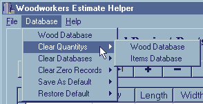 The shareware program, Woodworkers Estimate Helper provides a classical example of geekspeak. The program is "designed for woodworkers and cabinet makers", and purports to assist in the process of calculating price quotes for their projects. Unfortunately the program uses such esoteric programming terminology as "Databases", "Records", and, if the user attempts to enter a duplicate part name, presents the message "Key Validation Error". While we do not mean to disparage any woodworkers, we can quite confidently state that the typical woodworker has essentially no practical understanding of such terms, nor should they be required to.
Interestingly, aside from the menu items, the application makes no reference to a "Wood Database" nor an "Items Database". These menu items refer to grids on the main form that are labeled "Wood Project Parts" and "Other Expenses" respectively (just to add to the confusion, the Help file refers to the latter as the "Hardware Database"). Is it any wonder that many new users are intimidated by computers? (BTW, "Quantitys"?) |
 While many European users of Automate Pro will be comfortable with the 24-hour time format the program imposes, most American users will resent that fact that they have to perform some mental calculations to convert times from the familiar 12-hour format to the format required by Automate Pro.
Automate Pro should have respected the user's wishes and used the format specified in the user preferences section of the operating system. Admittedly, this would have increased the complexity of the source code, but then, the computer is much more adept at performing such conversions than the user. |
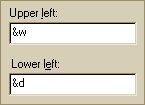 It would appear that at least some of the designers at Microsoft believe that the "G" in GUI must stand for "Geekspeak". This image was taken from the Page Setup function in Microsoft's Internet Explorer. The function allows the user to specify formatting to be applied to the headers and footers of pages printed from the browser. In the example illustrated, it should be clear to all viewers that the user has specified that the window title should be displayed in the upper left portion of the page, and that the date (in short format) should be placed in the lower left corner of the page. But, you knew that right? - not likely.
Despite nearly 20 years of research into graphical user interfaces, the designers of Internet Explorer decided that it was more efficient (for them) to require the user to either memorize a set of meaningless codes, or refer to the help file when interacting with their product. Here's a good rule of thumb for designing your own interfaces: if your users cannot utilize your design without referring to the help file, then your design probably needs work. |
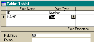 Creating a new table in a Microsoft Access table can be a trying experience. Typically, when one creates a table, one needs to specify the name of the field, the datatype (Integer, Long, Boolean, etc.), and, for Text fields, the maximum number of characters. Access however, makes this simple task exceedingly difficult. For numeric fields, Access requires the user to specify settings in two separate controls: the "general" data type (Number, Text, Currency, etc.), and the "specific" number type (Long, Binary, Integer, Double, etc.). This wouldn't be too much of a problem if the controls were in some proximity to each other, but Access' designers placed the specific number type control at the bottom of the form, did not assign a mnemonic access character to it, and did not place it in the tab order of the form. Basically, you can only get to it by clicking on it. (One can use the F6 function key to switch to the lower pane, but there is no indication that this functionality exists on the design window, in the menus, nor in the table design help sections of the help file). For text fields, the user must also specify the maximum length of the field ("Field Size") in the image above. Like the problem with numeric fields, this wouldn't be much of a problem if the Field Size control was somewhere near the Data Type control. Unfortunately, like the number type control, it is located at the bottom of the form, not in the control navigation path of the form, and without a mnemonic access character. In both cases, you cannot get to the control that you would most likely use next. The problem with the dialog is that Access did not place the necessary control in the grid (as with Name and Type). The final column in the grid is "Description", which most developers ignore. Had they placed Number Type and Field Size in the grid, creating a table would have been a much more efficient process. Although this image was taken from version 2 of Access, the design remains the same in Access 97. |
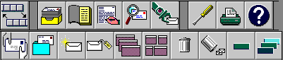
Icons are certainly a means of communicating to the user, well, some of the time. This collection of icons represents some of the many toolbar icons available in ccMail, and represents, from our view, perhaps the least intuitive collection of images intended for general use that we have yet come across. While some of the images are immediately recognizeable (e.g., the printer, and the trashcan), the functions of many of the images are completely unclear. We had to struggle to find the "Send" button, and arrived at it only by a process of elimination. To make matters worse, ccMail does not provide ToolTips ("bubble help") for the toolbar images, nor does it provide a status line description of the images. Users are justifiably hesitant to "explore" the toolbar, since they are afraid of initiating an unwanted action. Not surprisingly, many of the ccMail users we've spoken with choose to skip the toolbar altogether, relying instead on the menus the toolbars were intended to augment. |
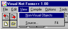 Is it just us, or does something seem ... odd about this particular menu option in Visual Forms? It strikes us as akin to "See the Invisible Man!"
In Visual Forms, this menu option allows you to specify whether or not formatting labels are displayed in the forms editor. In this case, "Formatting Labels" might have been a better caption for the menu item. |
|
This confusing array of commands is available in a tabbed dialog in OzWin II, an off-line Compuserve reader. Not only does the user have to resolve the differences between OK and Apply, he or she must resolve the differences between Cancel and Reset. Let's go to the OzWin Help file for an explanation of the distinctions: Make your option selections and then click the Apply push button. Items left blank or unselected (or in the case of checkboxes, left in a grayed state) will not be updated in the selected forums.Oh - now I get it. Give me a break! |
|
|
 When the designers of Microsoft's Word for Windows (6.0) realized that the FindFile function had more options than real estate, they decided to create a new control into which they could dump all the extra controls.
We're not too happy with the use of menu-type command buttons, since they operate unlike all other command buttons in Windows. They also introduce an extra step into the process of selecting a desired function. The designers at least provided an indication that there is something different about this particular button, unlike similar controls later used in Windows95. A bigger problem here is that the commands are not meaningfully grouped: the first 5 are related to the currently selected file, and the last is related to the entire list. The designers might just as well have just labeled the button Miscellaneous. If the items cannot be meaningfully grouped, then they shouldn't be grouped at all. "Things we couldn't fit elsewhere" is not a meaningful construct on which to design an interface. |
|
Read This! There is no reason to have exclamation points on your command buttons! They make it seem as if your application is shouting at the user! The fact that it's a command button already indicates that it is going to do something! The exclamation point adds nothing but perceived resentment! Don't do it! There, we feel better now. |
 This is not a serious problem, but it does illustrate that programmers view the world in a slightly different way than normal people.
One of the first things you learn as a programmer is that all of your previous mathematical education has been wrong. You don't start counting at the number 1, as in "1 Mississippi, 2 Mississippi, 3 Mississippi...". Programmers are taught that counting begins at 0. Thus, if you have a single banana in front of you, it would be called Banana 0. If you had 2 bananas, they would be called Banana 0 and Banana 1 respectively.
This is not a serious problem, but it does illustrate that programmers view the world in a slightly different way than normal people.
One of the first things you learn as a programmer is that all of your previous mathematical education has been wrong. You don't start counting at the number 1, as in "1 Mississippi, 2 Mississippi, 3 Mississippi...". Programmers are taught that counting begins at 0. Thus, if you have a single banana in front of you, it would be called Banana 0. If you had 2 bananas, they would be called Banana 0 and Banana 1 respectively.
Now if you're not a programmer, this would probably be somewhat confusing. In fact, this retraining is perhaps the cause of most of the mistakes made by new programmers. If they want to refer to the second item in a list, for example, they have to refer to item(1) in their code. Normally, this is hidden from the user. The designers of Netscape Navigator however, forgot that most people using their product are not programmers. (Those of you familiar with Carl & Gary's VB site, and the process of specifying mnemonic characters in Windows apps, might notice a slight bug in Netscape Navigator. It's not a big problem, but it results in a less-than-professional appearance.) |
Tom Erwich sent in this image of the High Scores dialog in the freeware game, xBlock.
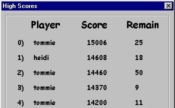 Somehow, I just can't envision people really aspiring to be 'Number 0'. As Tom quipped: It's nice to stand at the top. But in this game, instead of being a hero, you become a zero!. |
 We were exploring Netscape Navigator recently and came across this rather unusual symbology. We felt that the combination of the ALT, SHIFT, and < keys made for a rather awkward "shortcut" for moving to the previous page. Not only unusual, but unsuccessful as well. The symbology is intended to represent the left arrow key, normally represented with..."left" or "left arrow". Thank you Netscape, for the opportunity to laugh at our own silly interpretation of your terminology.
|
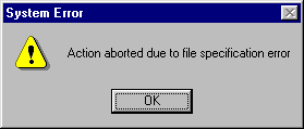 What the heck is a 'file specification error'? Sure, we know, but we've been using computers for a long time. The new user, however, most likely has no idea.
If you need to say that the program cannot find a particular file, simply state that the program cannot find the file. |
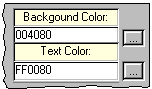 Why is it that programmers cannot grasp the fact that most users typically do not understand the RGB hexadecimal translation of color? It would make far more sense to display a selected color by showing the Color selected.
Of course, this design might be appropriate if users of Webforms thought in terms of, "Hey the background is a bit too rich, maybe I should use FF2ACC instead." |
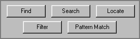 Sometimes applications give the appearance that the developers must have a dog-eared (Fetch!) thesaurus next to their computers. Each of these terms was used in various areas of the same corporate application.
Microsoft has reported that the term "Find" was most readily understood by new users. Search or Find, just be consistent within the application. |
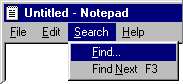 Despite the findings of their usability labs, Microsoft failed to retrofit the release of NotePad packaged with Windows95. It is the only Microsoft application we have found that offers a Search menu; in all of their other applications, the Find function is placed in the Edit menu. Inevitably, when we try to find something in Notepad, the system beeps at us, since it cannot resolve the ALT+E+F keyboard equivalent that works in every other application.
We were also disappointed to find that the new version of Notepad failed to provide a Search and Replace function. Given all the operating system releases and upgrades, you would have thought they would have fixed Notepad by now. More information on the Find command can be found in the Interface Stupidity section. |
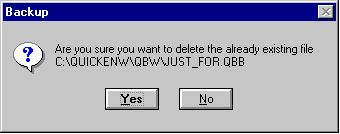
The Backup function in Quickbooks 4.0 provides a message that has no apparent relation to the function and has the effect of completely confusing the user. The user is first asked to select the file to be backed-up, and is then provided the message above. The problem is concisely identified in this message sent to us from Richard Lucey:
By the way, it's probably not all that important to point out that the user is about to delete an already existing file. We don't imagine that too many users try to delete non-existent files. |
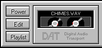 Sometimes you can carry real-world metaphors too far. IBM's Audiostation is a multimedia player that is pre-packaged with some models of their PCs. While "Power" makes sense to a stereo system component, it makes little sense in a computer application. Click on Power and the program ends, invariably eliciting an "Ooops" from the curious user.
|
 |
|
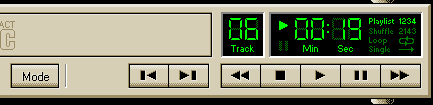
We were quite curious as to the function of the Mode button in IBM's Audiostation. The term "Mode" by itself is rather ambiguous, but even more problematic, it was only after clicking the button several times that we realized that it referred to the playback mode, which is displayed in the far right-hand portion of the display. At 640 x 480 resolution, there is a distance of 6 inches between the Mode button and the display.
We assume that this design resulted from IBM's attempt to mimic the real-world display of physical CD players into the design. Sure it looks cool, but by using the real-world metaphor, the software application becomes subject to the limitations of the real-world CD player. For example, the only way to determine which modes are available is to repeatedly press the Mode button; when it loops back to the beginning, you will know the range of possible playback modes.
|
 How the designer organizes information in the user interface can have important consequences on the efficiency with which the user can interact with the product. A case in point is provided by the Controls combo box provided by Microsoft Access 2.0.
 The controls combo box lists all controls used on a form. When the developer needs to modify the code for a particular control, he or she can access that section of the code by selecting the desired control from the list. What we find surprising is that Microsoft failed to provide any apparent order in the display of the controls. In other Microsoft development products, the controls are listed alphabetically. Access however, lists controls in the order in which they were added to the form. While this may make some limited sense at the time you are developing the form, it can wreak havoc on complex forms, and especially when the code must be modified at a later time. This is especially problematic when a programmer has to modify the code developed by someone else, as the former has no knowledge of when controls were added to the form, and therefore must read the entire list to locate the control of interest. After discovering this "feature" while modifying complex forms generated by someone else, we could only wonder, "What the heck was Microsoft thinking?" |
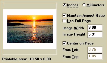 Paint Shop Pro is an excellent, full-featured graphics editing application. Unfortunately, it has one very annoying feature that dramatically detracts from its usability: the user cannot print an image at its actual size, at least not without having to pull out a calculator and performing some conversions. By default, the print function sizes the image to fit the page. The user can override this setting by entering the dimensions of the image in the Page Setup window shown above, in either inches or millimeters. The problem is that Paint Shop Pro, like most graphics packages, uses pixel measurement throughout the rest of the application. The actual size of the sunset image shown in the preview window above is 299 pixels wide by 186 pixels tall (approximately 4 inches by 2.5 inches). To print the image at its actual size, the user would either have to guess as to the approximate size of the image, or convert the pixel dimensions of the image to the scale of measurement used on the Page Setup window. Unfortunately, as is the nature of computer images, any difference in the dimensions of the image will degrade the quality of the printed image. A much more useable solution would have been to (a) default to the actual size, and/or (b) provide Actual Size and Fit to Page options. One additional problem is that the user cannot change the page orientation from the Page Setup dialog. The user would have to close the Page Setup dialog, open the Print Setup dialog, make the change, then return to the Page Setup dialog. That seems like a lot of unnecessary wandering about the application. Aside from these problems, Paint Shop Pro is an excellent program, and is one of the best shareware programs available. |
|
Please do not follow their example. It can only guarantee that your users will often approve dialogs they didn't intend, and cancel dialogs they intended to approve. |
|
By the way, both of the letters in "OK" should be capitalized. |
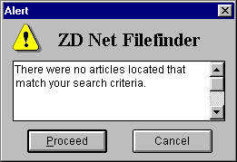 The message is clear and understandable, but the choices are ambiguous. This error message is displayed by ZDnet's File Finder, when a keyword search has failed to locate any matches. Having a choice where none would seem necessary creates uncertainty.
What does 'Proceed' do? The answer is the same as 'Cancel', except that it makes the user feel more uncomfortable. |
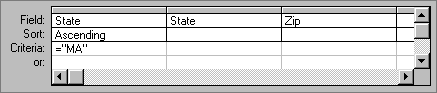
We weren't sure how to categorize this design 'strategy', but Microsoft's interpretation of "Query-by-Example" in Access is anything but clear and understandable. It would more appropriately be labeled Query-by-Confusion. The dialog attempts to combine too many functions into a single form, without providing any guidance, resulting in an interface mess that guarantees the user will have to refer to the manual to proceed. The dialog provides no indication of which search functions are possible (>, = , like, in, etc.), nor any guidance as to the syntax required of each. If the user wanted to select the records of all publishers in MA, NY, CA, and HI, would he or she have to include 4 separate conditions for State? To do so would greatly reduce the efficiency of the query. Similarly, does the user have to specify the sort direction of each field in the result set? Of course not, but the design of the form gives this impression. Given the complexity of the programming task, that is, to be able to perform all of the necessary functions, we're pretty sure that the developer was very proud that he or she was able to combine them into a single form. Unfortunately, by combining everything on a single form, the efficiency of each function is reduced to nothingness. The best solution would have been three separate forms: one for specifying the fields to be included in the results, another to specify the sort order, if any, and a third for specifying the search criteria. That way, the interface problems relevant to each function could be properly addressed. While we appreciate the difficulty of the task, and the complexity of the programmatic solution, from an interface perspective, the end result would be laughable if it weren't so sad. |
This toolbar, from Canyon Software's Drag and File, a very well thought-out replacement for the Windows95 Explorer, represents an interface technique we've not seen before, and well, we do not feel represents an advance in usability. Drag and File assigns mnemonic (keyboard access keys) to toolbar buttons, and displays the key in the button's image; the user accesses the function by pressing the ALT key and the mnemonic key at the same time. While we are very vocal supporters of mnemonic access characters on windows controls, we believe that placing them on toolbar buttons will be more problematic than helpful. We have the following concerns:
Drag and File has a few additional interface problems (e.g., toolbar functions that are not available through the menus, and images that are inconsistent with images used elsewhere, such as the binoculars for View and the magnifying glass on a page for Find), but is otherwise a very good program, and seems much better organized that Microsoft's Explorer. In particular, we feel that placing file-related functions (copy, delete, and move) under the File menu is a significant improvement over Explorer's Edit menu. |
© 1996-2000 Isys Information Architects Inc. All rights reserved.
Reproduction in whole or in part in any form or medium without express written permission is prohibited.
bchayes@iarchitect.com
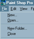 While we can somewhat recognize the rationale for renaming the menu item, PSP's designers failed to consider the problems it would cause. In addition to the fact that the function seems to have disappeared, the phrase "New Folder" has a different meaning in the Windows operating system (i.e., "to create a New Folder"). Further, and quite fortunately, PSP does not rename other menu items under similar circumstances. After opening an image, the menu item "File-Open" does not become "File-New Image". After creating a new image, the menu item "File-New" does not become ... "File-New New Image".