
In a graphical user interface, the controls represent the means by which the user communicates with the application. The quality of the communication depends on two aspects of the controls:
Select the wrong tool for the job, or change the rules under which the tool operates, and you will create problems for your users. Here are some examples...
Last updated 19-September-1999
 The editors of the August 1999 edition of the Visual Basic Programmer's Journal 101 Tech Tips for VB Developers must have been running low on tips to share with their readers. Tip #100 provided the code to make checkboxes act like option buttons:
Checkboxes and option button controls function similarly but with an important difference: A user can select any number of checkbox controls on a form at the same time, but can select only one option button control in a group at a time.We would have written the last line as: This change is useful when you want to confuse your users.Option buttons are used to allow the user to make a mutually exclusive selection. Checkboxes are used to allow the user to make multiple selections. The very appearance of checkboxes tells the user that he or she can select several items. Never use checkboxes when you want the user to make a mutually exclusive choice. |
 Visitor Cory King asks a very good question:
Why is it that Adobe Acrobat has the keyboard navigation keys mixed up? The "page up" and "page down" keys scroll through a page like you'd expect the arrow keys to do, while the up and down arrow keys scroll one page up, and one page down like you'd expect the page up/down keys to do. |
 "This is your brain on dope."
We found this bizarre design while reviewing the ad hoc reporting capabilities of an application developed in-house at a better-left-unnamed corporation. The dialog is intended to allow the user to specify the fields on which to sort the data in a report. As can be inferred from the image (and not without considerable difficulty), the user can specify sorting on three fields. Actually, the user must specify the sorting on three fields, since there is no way to indicate that you want to sort on any less. As indicated in the image, sorting the results by Part ID, then by Part ID, and then by Part ID would be just hunky-dory in the mind of the developer. (BTW, is anyone else reminded of pegboard-climbing exercises from junior high school gym?) |
 Grrrrr. Setting aside our feelings for Microsoft's policy of requiring Internet Explorer to successfully run Visual Studio applications, we found their method of indicating this requirement to be somewhat ... well, stupid. Since installing IE is a requirement, why use an checkbox to indicate whether or not you want to install it? You have no choice!. Unchecking the box has the effect of disabling the Next button, preventing the installation from continuing. |
 The folks at Ryka, a manufacturer of women's shoes, wanted to be certain that no potential customers could be excluded. Thus, rather than providing option (or radio) buttons to indicate one's gender, they decided to use checkboxes, to allow the potential customer to indicate Male, Female, or, well, both, and for that matter, none. We found this especially interesting given the company motto, "Exclusively for women by women." Inclusiveness must be "in".
|
 John Winters sent along a series of screen prints illustrating the useless progress meters implemented in Microsoft's Outlook. When dealing with a single message, the application displays a 2-state progress bar: the program is either busy, or it's not. Retrieving a message with a 340KB attachment over a modem connection typically takes 1 minute and 45 seconds. During that time, the progress meter is shown at its maximum value, rather than displaying the relative progress of the retrieval (something progress meters are supposed to do). The likely result of this misimplementation is that the user will conclude the computer has yet again locked-up, and will perform a three-finger salute to get back to work. |
 This particular design in Microsoft's Internet Explorer has prompted us to consider adding another category to the site: Silly Designs. Whereas toolbars are designed to provide rapid access to frequently used menu items, Microsoft's designers chose to use the toolbar to display...menus.
|
|
|
|
We are grateful to visitor Gordon Allison for providing this example:

|
 Microsoft's Visual C++ 5.0 offers developers a rather unusual spin control that caught the attention of visitor Mark Otway. As provided by Microsoft, the spin control operates completely counter to the typical user's expectations. To increase the value in the control, the user must click the down arrow. Similarly, clicking the up arrow decreases the value. The conscientious developer will have to write a routine to reverse the control rules so that the control operates correctly. As Mark notes, "With Microsoft providing this sort of 'help', it's a wonder anyone develops an app with any sort of decent interface....".
|

Click & Print Certificates is a useful little shareware program for printing a variety of certificates and awards. The program offers a "Style Buddy" to help the user select which of a number of certificates to print. Once you get past the obvious problems with the dialog (instructions in the title bar, right-aligned, vertically-oriented instructions, Cancel button before the OK button, reference to an "OKAY" button, the use of all capital letters, the hard-coded sickly green color, etc.), there are some important design problems related to the choice of control for selecting the desired style. The various styles can be previewed through the use of the horizontal scroll bar; each click displays a different certificate style. There are two significant problems with this design. In the first place, the only way to determine which styles are available is to scroll entirely through each of the styles. A second problem is that the only way to select a particular style is to browse through all those that precede it. For example, to select the "Team Player" certificate, the user must click on the scroll bar 9 times, waiting for the program to load a preview of each of the 9 certificates that precede it. We offer the following alternative to Click & Print's Style Buddy, which we feel resolves these problems.

|
 While checkboxes typically provide the means by which to specify options, Click & Print uses checkboxes as indicators and as command buttons. When the user clicks on a checkbox in Click & Print, a dialog box is opened into which he or she enters information to be printed on a certificate. The checkbox only becomes checked if the user clicks the OK button on the related dialog box.
Setting the date is particularly unusual. The program defaults to the current date, but the only way to get the date checkbox checked is to click it, then click the OK button in the Date dialog. The most problematic aspect of the design is evident when the user attempts to check the Print checkbox before he or she has checked all of the checkboxes above it: An error message is displayed, stating "The checklist is not complete. Are you sure you want to print?" Here's a lesson from GUI 101:
Don't let your confusion confuse the user. |

It would appear that the developers of Microsoft's Visual SourceSafe 5.0, were somewhat uncomfortable with the uncommon file dialogs used throughout Windows95, and decided instead to develop their own based on the Windows 3.1 common file dialogs. Unfortunately, they ended up combining the worst elements of each. As is indicated in the illustration, as the user drills down through the directory tree, he or she will need to use the mouse to scroll to the right to view the directories. In the course of so doing, the user loses information as to his or her relative position in the hierarchy. It would seem that the Projects line above would have been a good place to provide this information, but the developers chose to parse the full directory path and display only the lowest level. To determine where he or she is in the hierarchical structure, the user will have to use the mouse to scroll back to the left. By improperly sizing the folder display, the designers created a great deal of overhead for the user. |

Here's a classic example of selecting the wrong tool for the job, and the extraordinary measures users are required to use to overcome the control mismatch. OzWin II is an off-line reader for the Compuserve Information Service. One nice feature of the reader is that it allows you to specify a signature to be appended to your e-mail messages, such as: Brian HayesUnfortunately, OzWin provides a single-line textbox to enter this information. To add a line break in your signature, you need to embed the OzWin-specific commands, ^M^J in the text. This of course, requires that you first read the help file to determine (a) line breaks are permissible, and (b) how this can be accomplished. A far more appropriate and intuitive approach would have been to use a multi-line textbox. |
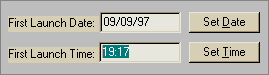 Each of us has been using computers for a long time, and has grown quite fond of using the keyboard to enter data. Imagine our surprise then, when trying to enter the schedule time for an event in Automate Pro, we found that despite its appearance, and the fact that we can select text, the control ignores input from the keyboard.
We would have preferred that Automate Pro allow the user to employ either method to specify the time. Gimmicks such as their clock control, if necessary at all, should be offered as an alternative method of entering data, and the user should be allowed to choose which is most efficient for him or her. |
 Ewan is a shareware terminal emulation program thoughtfully provided to us by our Internet service provider. The illustration shows the "Ewan Popup Menu" (thank goodness the designers provided a title on the menu, otherwise, we might not have known what it was) that appears upon pressing the right-mouse button when the cursor is over the main window. The problem, as we see it, is that the menu provides far too many irrelevant actions, making it difficult for the user to locate and navigate to the intended action.
Given that the Popup menu is redundant with the main menu, and that it requires complex mouse movements to navigate, we cannot see why a user would ever bother with it. For the record, the version we were provided is somewhat dated (17-Jan-95 in fact); we are hopeful that Ewan's designers have since provided more context-sensitive context menus. |
 SimCity 2000 by Maxis is undoubtedly an engaging (OK, addictive) simulation game, but it does have one unnerving feature that can really interfere with a new user's ability to learn the game. Several of toolbar buttons (notably, not all of them) quite unexpectedly have submenus associated with them, which are available only when the user holds the mouse button down for a period of time after clicking on the toolbar button.
This feature was not immediately apparent after a quick review of the user manual, and the toolbar images provide no indication that this functionality exists. Nor is there any indication as to which toolbar images have submenus associated with them. The problem was clearly evident when one of our colleagues needed to add a power plant to his city: the help file merely stated that you simply clicked on the Power toolbar button, but after doing so, the user found that the action only added more power lines to the city. It was only after considerable trial and error (and the resultant frustration), that the user found that if you clicked and held the toolbar image down, a submenu offering power plants became available. One further problem with this design strategy is that a normal button click on the toolbar image will perform the most recent submenu option, but the image provides no indication of which option that might have been. The end result is that the user ends up making many inadvertent selections, or learns to always wait for the submenu to appear before continuing, thereby reducing the efficiency of his or her task. |

Ever wonder about the sequence of building a window in a GUI application? This sequence is particularly apparent in Unisyn's Automate Pro. The developers apparently forgot about the concept of tab navigation among controls, relying instead on the tab order generated by the programming environment. The sequence of navigation among controls as the Tab key is pressed is illustrated above. As indicated in the figure, the developer first created the Regarding field, then added the OK and Cancel buttons, the Set Frequency button, and so on. The end result of this inattention to the user interface is that the user must press the Tab key seven times in order to move from the Regarding field to the Message field. Perhaps they'll correct it in version 3.8g... |

|
|
Consistency is one of the first rules of interface design. The designers of IBM's AudioStation, a CD-player application, were apparently unaware of the concept. This image is taken from the Playlist function of the application, which allows the user to select the songs and specify the order in which they are to be played (well...sort of). The dialog provides two list controls: the CD Tracks List (on the left), and the Playlist on the right. The major problem with the design is that the two lists operate differently. For example, double-clicking on a song in the Track List will cause it to be copied to the Playlist; however, double-clicking will not remove a song from the Playlist. Additionally, whereas the Track List supports extended multiple selection, the user can select only a single song at a time in the Playlist, making the design a contender for our Interface Stupidity section. There are a number of other design problems with the Playlist function, which we have listed below. Take another look at the image and see how many you can spot (some of the problems are detectable only through actually using the application, something IBM should have tried before they released the application). Consider this an experiment in web site interactivity...Hold your monitor up to a mirror to see the problems we've identified (or if that's too awkward, just click on the list below): 
|
 Normally we consider providing context-sensitive help to be a good thing. WebEditPro however, proves that there is a limit to the usefulness of that help. On the positive side, WebEditPro provides tooltips-based help for almost all controls (and for some non-controls) in the application. On the negative side, this help is provided automatically, and there is no way to disable it. Any time the cursor pauses briefly over a control, a lengthy explanation of the control is provided to the user. While at first glance this may seem beneficial, it can result in an infuriating experience in practice. The tooltips are subject to frequent inadvertent display, interfere with the user's ability to peruse the dialogs, and cause the user to conscientiously position the cursor away from the current dialog in an effort to defeat the help.
One of the basic tenets of interface design is that the user should feel that he or she is in control. WebEditPro removes this aspect of control from the user, and as a result, becomes distracting and annoying. Nobody likes a know-it-all, especially when his or her input was unsolicited. Providing help is a very good thing, but let the user request it. |
 Here's an example where the control choice is reasonable, but the units of measurement leave something to be desired. To set the size of the history cache in Microsoft's Internet Explorer, the user is provided a slider control as asked to specify the amount of space on the hard drive to reserve for storing visited pages. The problem is, the cache size is set as a percentage of drive space. A few years ago, this would not have been an issue, but as indicated in the following message we received from Ross Cormier, Microsoft may want to rethink this practice:
User control is a point worth considering. |

The installation program for PowerSearch asks you to specify the directory into which it should install itself. The user normally selects the default directory, and the installation proceeds accordingly. Unfortunately, if the user wants to install the program into a different directory, he or she is faced with a few problems, since the dialog provides no controls to assist the user. The user must either recall the directory from memory, or use some other program to locate the appropriate directory. In either case, the user will need to type the information, which only increases the likelihood that an error will occur. A related aspect of this dialog would earn it a place in our Interface Stupidity section. The application must be installed into the Startup directory for Word for Windows; if the user selects some other directory, the PowerSearch add-in will not work. This requires that the user know where the directory is located, and because the program does not verify the accuracy of the user's selection, the potential for a serious error is increased. The addition of a single line of code would have made the installation program intelligent enough to determine the appropriate directory, and prevent the user from making unnecessary mistakes. |
 Despite all that has been learned about human interaction with computers, Microsoft still finds ways to come up controls that are basically inefficient. This list box is provided by the Certificates function in Microsoft's Internet Explorer. Humans can scan written material faster from top to bottom rather than left to right. Despite this widely-accepted observation, and despite the fact that vertically-oriented lists are used throughout Windows, Microsoft chose to require the user to scroll horizontally in this particular list. In contrast to the single-item scrolling permitted by vertical lists, horizontal lists create huge visual changes in which the list is complete redefined, and after which, requires the user to scan vertically anyway. The most unfortunate aspect to this is that other developers will erroneously conclude that, since Microsoft is doing it, it must be good design. It's not.
|

We weren't certain just how to categorize this particular problem, but in our view, displaying only 3 items in a listbox is just plain stupid. This dialog box is provided by the Associate function in Microsoft's File Manager, as is displayed when the user wishes to associate a particular file type with an application. In this example, there are 133 entries in the list; clicking the page portion of the scrollbar will display the files 2 at a time. We are at a loss to explain why the developer didn't use more of the available space on the form to make the list larger, or why he or she didn't just make the form larger. The end result of the developer's lack of thought is a control that is essentially useless for the task at hand. |
 Just when you thought it couldn't get any worse, Microsoft found a way to further reduce the efficiency of listbox controls. The user-centered designers of Visual Basic 5.0 decided to eschew the obviously more appropriate ComboBox, or drop-down, control, and chose a 2-line listbox instead.
|
| We first came across this example of the inappropriate choice of controls for a task in a form at a web site, and have since seen the technique inappropriately employed in certain desktop applications as well: | |
|
(We have discovered that some browsers may not display the control as we had found it. Here is a static image of the same control).
Now imagine trying to scroll through a list of 30 items, one item at a time. |
|
|
Interestingly, both methods were employed within the same form.
The problem, of course, is that the first method ("Spin ComboBox"?) requires much more intervention on the part of the user, and requires much more of his or her attention to make the appropriate selection than the simple ComboBox method. The simple ComboBox method takes advantage of our human ability to rapidly scan information, thereby more rapidly locating the item of interest (pun not necessarily unintended). |
|
|
The decision to use the first method may have been due to the fact that certain browsers do not handle large lists well (Netscape for Unix comes to mind), but we feel that a more appropriate compromise would have been to use a standard ListBox as shown here, which allows the author to limit the number of items displayed at one time: |
|
| We found it even more interesting that the Spin ComboBox method was set so that multiple selections could be made. We challenge you to try, then compare it to multiple selections in the ListBox method. Which do you feel is more straightforward? | |
 In their misguided attempt to make their program look different, the developers of IBM's Aptiva Communications Center decided to forego the use of standard Windows controls and instead, develop their own. They have certainly succeeded in their quest; the application is unlike any other application running in the Windows environment. Unfortunately, that's the problem, and the image displayed here only illustrates one very small difference.
Unlike life in high school, in graphical user interfaces, looking like everyone else is a good thing. When applications look and act alike, users learn them much more quickly, since they can transfer their knowledge of one application to the others. When your application looks and behaves unlike other applications, your users will require more time to learn how to use your application. Novelty for novelty's sake is never a good thing. One only need to recall the experience of sitting in a rental car, trying to find where the controls are located in this particular car. (The auto industry has gotten much better at this; in the seventies you never knew where a control might be located). The use of diamond-shaped rather than round option buttons only increases the likelihood that some users will be confused. Even more serious, the option buttons act like command buttons; click on one and the program will jump to another dialog. Just to add to the confusion, the application intermixes the standard and custom option buttons, both in terms of appearance and behavior. Don't strive to be different. Strive to be good. |

The designers of HTML Transit have an obvious affinity toward command buttons. Buttons are repeated everywhere, giving rise to visions of a rabbit farm. On one particular window, there were 15 "Color..." buttons. The window displayed here is used to specify the various images to be used for navigation buttons on a web page. The "Browse..." buttons (all of them) allow the user to specify a filename for the selected function. The "Gallery..." buttons (all of them) are used to select an image from the program's ClipArt gallery. We shouldn't have to say this, but when you have to devote more than, say, 25% of your window's real estate to command buttons, you probably have too many buttons. You should never have to duplicate a command button more than once on the same window, never mind 9 times, and certainly not 15 times. |
 One of the basic rules of GUI design is that controls that are disabled should appear to be disabled. One can normally tell at a glance whether or not a particular menu item, command button, list, or drop-down control is available. Why is it then, that Microsoft chose not to provide a disabled appearance for their toolbar buttons in certain applications? This image is taken from the Office95 version of Microsoft Word, but the violation is apparent in all of the Office95 applications. We know that Microsoft's developers are certainly capable of dynamically changing the appearance of toolbar images; it's not all that different than changing the appearance of a standard command button. Our only guess is that the graphics artists at Microsoft simply didn't like the look of disabled toolbar buttons, regardless of the extra information the disabled appearance provides to the user. Unfortunately for the user, interface design at Microsoft is now the responsibility of graphics artists rather than interface designers. It should come as no surprise then, that Microsoft is far and away the most frequent contributor to the Interface Hall of Shame. |
 The PowerBuilder programming environment provides tooltips for its toolbar icons. That's good. It also provides status bar descriptions for the toolbar icons. That's also good. The tooltips presentation is delayed, as it should be, such that the user must pause the cursor over the button for a period of time before the tooltip is displayed. The problem is that the status bar descriptions are also delayed, resulting in the incorrect description being displayed while the program waits to display the correct description. Here's the rule: tooltips should be delayed 1-2 seconds, but status bar descriptions should be immediate.
|
 Select Cut from the Edit menu of just about any application and what happens? The selected text or object is removed (and a copy is placed in the clipboard for later use). This rule is so ingrained that the phrase "Cut and Paste" could be considered a cultural archetype: almost everyone over the age of four knows what it means.
Unfortunately, the designers of Microsoft's Excel weren't familiar with the phrase. To them, "Cut" means "Leave it there", or at least, "Leave it there until I Paste it somewhere else." Upon selecting Cut, a moving border is drawn around the selection, which indicates, intuitively speaking, Nothing! Cut will not remove the selection until the user selects Paste at some later time. In Excel, "Cut" really means "Indicate the selection you might want to Move at some later time". In fact, after performing the Paste operation of the complete Cut and Paste sequence, the Undo command is labeled "Undo Move". By changing the rules, every new or occasional user of Excel is instantly perplexed when performing the Cut operation. The typical user will Cut, and Cut again, and perhaps Cut again in an attempt to understand what he or she has done wrong. They've just got to be chuckling about this one in Redmond. (Thanks to Steve Bliss for reminding us of this Excel feature) |
 If you really want to frustrate your users, make sure that you use the same mnemonic access or keyboard access characters for different functions. In the GIF Construction Set the keyboard access keys for the Cut and Copy functions are the same. The net result of this design error is that the keyboard access commands don't work, at least, not as the user would expect them to.
In all other applications,
In GIF Construction Set,
As further evidence of their lack of familiarity with mnemonic access characters, they "forgot" to include them for the bottom four items on the menu. By the way, it's no longer necessary to display the Shift+Ins and other alternative shortcuts. It's a good idea to support those options, but continuing to display them merely confuses the new user. |
 This type of control is seen all too often in corporate applications: drop-down controls and lists that contain thousands of entries. Programmers who mistakenly use it generally get a hint that it might be inappropriate when they find out that it takes an extraordinarily long time to load the form. The following message, posted in a Visual Basic programmers forum on December 11, 1996, is typical:
I want to fill a list box with 2000 items ... This takes incredibly long ... over 20 minutes. Any ideas?And another posted on December 16th, 1996, is somewhat less typical: I'm looking for a list box control that can ... hold large numbers of entries (20,000+) The excuse for such unwieldy controls is often a misguided interpretation of the almighty call to arms, "We must ensure data integrity." The programmers want to make sure that the user specifies a valid entry; in their view, the best way to do this is to force the user to select from a list. That would be fine if you had, say 20, 60, or maybe even 100 items in the list. Beyond that number, the fact that the user can only scroll a handful of items at a time causes the control to become unwieldy. Imagine if you didn't have folders and directories on your hard drive. Whenever you needed to specify a file, you were presented with a drop-down control containing the name of every file on your hard drive, and asked to select the one you wanted to open. Few people, programmers included, would consider such a method as anything less than completely unacceptable. All data can be organized in some meaningful way that will allow the user to more rapidly access the specific information he or she is interested in. Files are organized into folders or directories for example. Employees are often categorized by department, job title, or salary grade. Designing the interface to exploit the appropriate organization will allow the user to more rapidly locate the desired information, while at the same time, "ensuring data integrity." |
 Based on concern over the typing ability of some of the 400,000 corporate users, the project manager of this particular application insisted that drop-down controls be used to collect information wherever possible. Fortunately, he was transferred to a different project. Based on concern over the typing ability of some of the 400,000 corporate users, the project manager of this particular application insisted that drop-down controls be used to collect information wherever possible. Fortunately, he was transferred to a different project.
|
 The programmer of this corporate application had apparently not yet read the chapter on the use of drop-down controls. Makes you wonder how the user is asked to specify his or her country. The programmer of this corporate application had apparently not yet read the chapter on the use of drop-down controls. Makes you wonder how the user is asked to specify his or her country.
Designs like this often result when the programmer not only lacks knowledge of proper interface design, but also lacks experience with the Windows environment. Such designs are inefficient for the user, and result in larger, more sluggish applications that waste system memory and resources. |
 Microsoft's Web Publishing Wizard is used to upload files to an Internet server. As such, you would think that selecting files would be the most important part of the program. Unfortunately, it's among the most difficult. The "Wizard" allows you to specify either a single file, or a directory of files; there's no in-between. The "Browse Files" button takes you to a Win95 common file dialog that only allows you to specify a single file. The "Browse Folders" button allows you to specify an entire folder. To update 2 files, for example, you would have to create a temporary folder, copy the files to the folder, run the Wizard, then delete the temporary folder.
Just to add a little confusion, you must select the "Include Subfolders" option, even if the folder you selected contains no subfolders. Otherwise, no files will be selected: the Wizard will connect to the Web site, then ask you to specify which of the non-existent list of files you want as your initial page. |
 Notice anything missing? After connecting to the web site, the Web Publishing Wizard asks you to indicate which of the files should be used as the main page for the site. Unfortunately, it requires that you upload the main page every time you make a change to your site, even if the main page hasn't changed. If you forgot to include the main page in the list of pages to be uploaded, you're out of luck - there's no way to go backwards to add the forgotten file, or to cancel the upload. You must select one of the files in the list, even though you know it's the wrong file. You might try the Close box on the window's title bar, but that merely closes the window; the application will still (incorrectly) advance to the upload process.
|
 You might be tempted to ask, 'Where's the OK button?' Well, that's not the problem. The image displayed here is the progress window displayed when uninstalling Freeloader, an off-line internet browser. When the window is first displayed, the user typically believes that it is providing options as to which components should be removed, and clicks each of them, thinking, 'of course I want the executable removed', 'I think I want the registry entries removed...', and possibly, 'maybe I'll keep the screen saver'.
Unfortunately, while the checkboxes will accept user input, the user's actions are meaningless. The checkboxes are used only to indicate which of the lengthy uninstall processes have completed so far. As the uninstall proceeds, the program will check all of the boxes, then remove the form. Checkboxes are active controls: they invite manipulation. Using checkboxes solely for display purposes is simply playing tricks on the user. |
 Some regard the failure to provide keyboard access to the application's controls as a mere oversight. We regard it as an indication that the developer is a hunt-and-peck typist. As the saying goes, mice are nice, but most experienced users have found that the keyboard is faster. Touch-typists, on the whole, hate to be required to remove their hands from the keyboard.
Based on the almost complete absence of keyboard access in Time & Chaos, we are convinced that not only that its developers are not touch-typists, but that they aren't very familiar with the Windows environment. In most situations in the application, the only way to navigate to a control or field is to click on it. Navigating among controls by pressing the Tab key is usually not permitted. This is unacceptable, especially since this is the 5th major release of the product. |
 Users of the Edit Image function of The GIF Construction Set will readily identify with the frustration caused when the developer has neglected to provide keyboard access to interface controls. Among other properties, the window allows the user to specify where the image should be located. Unfortunately, after specifying the 'Left' location, the only way to get to the 'Top' location is to click on the textbox; the Tab key will not move the cursor to either of the text boxes, nor are keyboard access keys provided. The end result is that the interface becomes a frustrating burden as the user is forced to repeatedly switch from the keyboard to the mouse.
|
 As further evidence of their love affair with the mouse, the developers of Time & Chaos decided to extend the new Windows95 interface standards. The application not only supports right-click context menus, it supports left-click context menus as well: click on any of the objects on the form with either mouse button, and the context menu will be displayed.
On the surface, it seems like a reasonable idea. In practice however, it becomes infuriating. Once displayed, there's no easy way to hide the menu. Normally in Windows95, if you want to hide the context menu, you simply click the left button. Once the context menu appears in Time & Chaos, you have to either hit the escape key, or click somewhere else on the form (which is likely to display another context menu). The new user is likely to spend much of his or her time trying to get rid of the menus. |
 A calendar graphic, properly applied, is often the best choice for entering dates. Here's an example where the intention was there, but the execution was lacking.
In Classified, a shareware diary program, the user cannot directly type the date of birth, but must use the calendar object, which appears after clicking on the drop-down arrow. The only way to change the year is to use the scroll arrows at the bottom: one click for each month, 12 clicks to the year. Now my birthday isn't too far off from the default date shown, but even then, it required 112 mouse-clicks to set it (could the developer be related to the manager of the SSN project above?). Some users might be tempted to use the thumbnail in the scroll bar to advance the rate more rapidly, and it does: because the program accepts dates in the range from the year 1800 to the year 9999, each pixel movement of the thumbnail changes the date by 51 years. Since birthdates cannot be in the future, and there probably aren't too many computer users born in the year 1800, the range of acceptable values could probably be reduced without excluding too many people. |
 Visual Labels supports the use of right-click context menus. Well, 'supports' is somewhat inaccuate; Visual Labels requires right-clicks to perform necessary functions. It is the only way to access necessary functions.
Right-click context menus are a useful addition to interfaces. They are intended to be an alternative means of accessing functions; as shortcuts, primarily for advanced users. They should never be required, and should always be used in conjunction with conventional menus. Otherwise, new users might never realize the functions are available, and they will have no keyboard access to the functions once they find them. Whenever a new user is observed using a program that requires right-mouse clicks, they will inevitably ask, "How do I ...", and when instructed, will invariably respond with "Gee ... that's odd." |
 Visual Labels uses a rather odd toolbox. It requires that the user drag from the toolbox to the desired location. Toolboxes usually serve as a collection of tools: click on a pen and your cursor behaves as a pen; click on a paintbrush, and your cursor behaves as a paintbrush, etc.
The toolbox in Visual Labels is much more difficult to get the hang of. First, forget the operating characteristics of every other toolbox you have used. Then, click the mouse button and hold it, dragging the mouse to the drawing area, being careful to keep the button pressed while moving the mouse. This can be unnerving, especially to users familiar with any other drawing tool. One of the principles that makes GUI easy to learn is that interface features are consistent across applications. Changing an established standard can only lead to confusion. |
 Occasionally you'll come across an application that shows such complete disregard for established design principles and industry standards that you have to wonder if the developers have ever used a graphical user interface. This image illustrates a central design idiom used in PeopleSoft applications. A proper critique of PeopleSoft applications would require megabytes of storage, so for the time being we will simply focus on their novel use of scrollbars.
Scrollbars in PeopleSoft applications are used as database navigation controls. In the illustration, clicking on the outer scrollbar would display the next category of awards, and clicking on the inner scroll bar would display the next award in the current category. Keep in mind, the frames do not scroll up and down; the information in each is simply replaced. PeopleSoft often nests scrollbars 3 or 4 deep, such that the user becomes absolutely dumbfounded not only as to how the information is arranged, but also as to how to navigate within a window. |
 Scrollable forms are a sure sign of inexperience in graphical user interface design. These often result from the conversion of legacy applications to the Windows platform, or in the development of applications based on paper forms. Scrolling forms hide important information from the user, hide navigational aids and controls, and require more user inputs to get to the desired information.
Unfortunately, visit any programming support forum, and you'll see an ever-increasing number of new programmers asking how to create scrollable forms. The only appropriate answer is, "You don't." |
© 1996-1999 Isys Information Architects Inc. All rights reserved.
Reproduction in whole or in part in any form or medium without express written permission is prohibited.
bchayes@iarchitect.com
 As can be seen in the image of the Favorites menu, the Favorites toolbar image merely replicates the menu. In so doing, the designers have provided no additional usability benefit, and in fact, have decreased the usablity of toolbar buttons by changing the control rules: toolbar buttons no longer initiate an action, certain "special" toolbar buttons require the user to distinguish among various types of toolbar buttons and may require a subsequent action of the user. Since there is no benefit to the design, we regard it simply as ... well, Silly.
 Rather than allowing the user to simply enter the time directly, Automate Pro requires that the user click on the Set Time button and enter the time using their special "Clock" control. If it were not for the instructions on the form, few users would intuit how to use the control to specify the time.

 As undesirable as the Calendar menu title (button?) is, it is far better than the direct menu commands used frequently in the sample programs provided with SQL Windows. The SQL Windows documentation states that the exclamation point alerts users that the menu title is a direct action command. In our view, the exclamation point only alerts users that they are using a downright hostile application.