
Occasionally we come across applications that employ interface elements that are so intuitive and effective, that we feel all applications should emulate them when appropriate. The Hall of Fame is a collection of design solutions that will likely improve the effectiveness and usability of all applications that employ them. We applaud the designers and developers for their creativity and for their consideration of the needs of the user. If you are aware of interface elements and techniques that you feel are worthy of mention, please drop us a line and help up spread the word.
Last updated 8-June-1999
|
|
|
Mark Powell sent us image is from Eudora Pro for Macintosh, which provides a very useful solution for a very frequent problem. 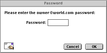 Since most passwords are case-sensitive, attempting to enter a password with the Caps Lock key on often leads to an invalid password error. Thus, indicating that the state of the Caps Lock key may interfere with the processing of the password is a very good idea. The only changes we would suggest would be to do away with the blinking (it's an unnecessary distraction), and do away with the exclamation point (such alarm really isn't necessary). |
 In the course of developing an application, programmers rely heavily on the Find function to locate specific text within the often lengthy programs. Recognizing this, the developers of Microsoft's C++ not only provided easy access to the Find function, they gave it a memory, so that the programmer can quickly resubmit a previous search. The Find function is provided through a drop-down control in the toolbar of the main window. The programmer can either type in a new keyword, or can recall a previous keyword from the list. To move to the next occurrence of the keyword, click on the Find Next icon, located to the right of the drop-down. The developer has instant access to the Find function without having to open a separate window to perform a search. In engineering terms, we consider this a very elegant solution.
|
 NewsFerret by Vironix Software Labs is a useful shareware utility that performs off-line searches of Usenet news servers. Depending upon your search criteria, this can be a very time-consuming process. Rather than simply displaying an hourglass cursor on the screen, the designers opted to use an animated control to keep the user informed that the program is still working. We think it represents an appropriate use of graphics, which provides an informative, yet subtle and non-instrusive message to the user.
A status bar in the lower left corner of the window indicates which newsgroup is currently being searched. The user can interrupt the search by selecting either the Stop or New Search buttons. (The actual animation is more detailed and much smoother than this facsimile). |
 The most recently used files (MRU) concept represented a real boon to efficient interface design. The application maintains a brief list of the files you recently accessed with the application. Its use is based on the observation that most people tend to return to the same file upon restarting an application. Rather than traversing the file hierarchy, the user can return to a recently used file with a single mouse click.
Even though the concept has been around for quite a while, few programmers employ it in their applications. Any document-centric application can benefit from the use of MRU lists. Its benefits are not limited to document editing applications, such as text, sound, and graphics editors, but also any application in which the user deals with conceptual objects, such as employee profiles, reports, and even address books. Rather than being a feature, the MRU list should be regarded as a standard. |
 The designers of CoolEdit95 have taken the MRU concept further, exponentially improving the efficiency of locating files within the complex file hierarchy. CoolEdit95 is a very good shareware Windows sound file editor. The designers modified the Windows95 standard file dialog to include a most recently used directory control. The control maintains a list of the last 8 directories used across sessions with the program. Thus, rather than having to navigate through the complex hierarchy of folders on the hard drive, the user can get to the one of the recently used folders with 2 mouse clicks. This greatly reduces the amount of time it takes to locate a desired file. This is a truly efficient strategy that we hope more applications will exploit. |
 When Microsoft's Visual Basic 5.0 first starts, it thoughtfully provides a tabbed dialog that quickly allows you to start a new project, open an existing project, or open a recently used project. The dialog provides a nice starting point for a new user, and is a welcome change from previous versions of the product that always started by loading a skeleton framework for a new project. This latter behavior entailed a considerable waste of time, since the user will most likely ignore the skeleton and work on an existing project (he or she would have to wait for two projects to load: the skeleton, and the desired, existing project). We do have one complaint about the dialog however: on the Recent tab, we would have preferred that the entire row be highlighted when selecting a project. As indicated in the image, only the first column of the selected row is highlighted, and moreover, attempting to select a project by clicking on the path in the second column will not change the selection - the user must click in the first column. Despite this quirk, and the fact that the dialog always opens on the New tab (developers will most frequently be opening the last project they were working on), VB developers have found the dialog to be a vast improvement in the evolution of Visual Basic. |
 Presenting a small graphic with each item in a list allows the opportunity to provide additional information to the user, without sacrificing valuable screen real estate. Most users are aware of its use in Microsoft's File Manager and Explorer to distinguish between files and directories, and also among file types. Here, it is shown as used in Microsoft's Visual Basic to indicate the type of files used in the project.
|

In addition to distinguishing among file types, the list graphic can also provide important information in other situations as well. We've utilized the technique throughout HartPro, our own database reporting application. In this example, it is used to indicate the types of fields in the database. Indexed fields are indicated with an 'i' in the field symbol, user-created fields are indicated with the 'f' in the symbol, and so on. In other areas of the application, it is used to provide additional information such as distinguishing among types of database tables and indicating sort order. In-line list graphics should be used whenever lists of items are displayed. They are especially important whenever items of varying types are displayed together (heterogenous lists), and when the application displays different lists of homogeneous items (such as a list of reports, and a list of employees). Care should be taken to keep the graphics small, simple, and subtle. |
 Given all the passwords each of us must keep track of these days, it's all too easy to forget the password for a particular account or program. The designers of Classified!, a shareware personal diary program, cleverly anticipated this problem.
When creating a new account, you are asked to specify the new password, and in addition, provide a question and answer, in the event that you forget your password at some later time. The login window includes an "I Forgot..." button that will prompt you with the question and await your response. This is a terrific solution to a problem that has plagued sysops everywhere. It is an interface feature that should be considered for every application that requires a password. |
 When the user is inserting a picture, Microsoft Publisher employs a modified file selection dialog that previews the picture before the file is selected. This is very smart, and makes a lot more sense than waiting until the user is returned to the main application before displaying the image.
Due to the potential delay in loading the previews, the designers thoughtfully provided an option to disable the preview function. |
 If your application uses a restricted set of images, the Insert Clipart function used in Microsoft Publisher is an improvement over the Insert Picture function above, in that it allows the user to view more images at a time, and to select an image based on the image (what an idea!) rather than its name.
The major drawback of this technique will be related to the number and complexity of the images to be displayed. To minimize the delay associated with loading a large number of images, it would be best to employ some organization of the images, through a list of categories as shown, or through a drop-down box. |

|
| Sometimes, a preview of the image alone does not provide enough information to make a selection. In certain applications, an indication of the size of the image will help the user select the appropriate image. In our Puzzlit game, users are provided a small preview and the actual dimensions when selecting an image for the puzzle. This can be especially helpful when viewing the images in the cache of an internet browser, for example, that includes both thumbnail and complete versions of the same image. As shown here, we also allow the user to select the scale of the dimensions, and the program remembers it between sessions. |
 This should come as no surprise. Tooltips have become essential in applications that utilize toolbars and toolboxes. They enable new users to learn the interface more rapidly by making the toolbar less intimidating, and they allow the user to rapidly locate functions that may otherwise have been buried within the menus.
Like all good things, tooltips can be overused, to the point of becoming distracting. Their use should be limited to toolbars and toolboxes, and the user should be provided the option of turning them off. Tooltips should never be used for command buttons and text boxes; if your labels do not provide sufficient meaning, then you need different labels. |
 Rather than completely submit to the whims of Microsoft's graphics artists, the designers of the web browser Opera decided to provide a welcome option for those of us who find the Microsoft "Coolbar" to be a distracting gimmick. The "Show Border" option in Opera allows the user to display toolbar buttons as they should be displayed, as controls that indicate they are indeed controls, without the distracting flashing of the button border as the mouse passes over. We strongly encourage all those developers who have felt compelled to use Microsoft's latest flash and trash gimmick to provide a similar option.
|

The web browser Opera provides a number of very useful features that greatly enhance its usability. One very notable feature is the ability to quickly enlarge or reduce the web page through a drop-down control, or by pressing the "+" or "-" keys. Vision-impaired users, late-night surfers, and those that are subject to web authors that have selected too small a font will find this a very welcome feature. |
Home - Design - Announcements - Shame - Fame
© 1996-1999 Isys Information Architects Inc. All rights reserved.
Reproduction in whole or in part in any form or medium without express written permission is prohibited.
bchayes@iarchitect.com