
While the Windows 3.1 File Manager was certainly not perfect, it performed file management tasks well. Ask a former Windows3.1 user about his or her first impressions of Microsoft Explorer, and the response will most likely be "Hated it." Clues to its problems were evident in some of the early reviews of Windows95, and the many "Win95-HowTo" books. Many authors proclaimed that "it will seem difficult at first, but after you get used to it you'll find that it makes a lot of sense." Imagine telling that to your customers.
Last updated 15-December-1999
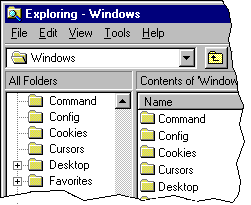 Explorer uses a hierarchical outline control to show the contents of all drives at the same time. Microsoft itself reported that new users had difficulty with the control, which is why 'My Computer' only shows the contents of a single drive at a time. There are two major problems with combined control approach. First, once you have navigated sufficiently into a particular drive, there is no indication as to where you are in the hierarchy. As shown in the image, there is no indication of which drive you are currently exploring, nor can you tell which direction to scroll to get to a particular drive. Microsoft concluded that new users were overwhelmed by the amount of information presented in the combined control. We would conclude that the problem isn't so much the amount of information, but the lack of spatial information. Based on the way the information is presented, it is very easy for the user to lose track of where he or she is at any given point.
Combining all of the drives into a single control also presents a second problem in that it can be difficult to switch from one drive to another. To get from drive C to the contents of drive G, for example, you have to either collapse the outline, manipulate the combo box, or scroll past all the displayed contents of drives C, D, E, and F. In contrast, in File Manager, all you have to do is click on the 'G' icon. |
|
To further add confusion, dragging behavior also depends on the number and type of files dragged. Drag a set of executable files and a shortcut to each is created in the target directory. However, if at least one of the selected files is a document file, then all files are (really) moved, regardless of each file's type. One of the most disturbing aspects of these distinctions is that certain actions cannot be undone. For example, you can Undo the dragged movement of a document file, but you cannot Undo the dragged movement of an executable file. The real problem arises in that the Undo functionality is related to the last "undoable" action, not the last action. For example, drag a document to another folder. Then, drag an executable to another folder. Selecting Undo would undo the first move, not the most recent. This increases the likelihood that the user will inadvertently Undo something he or she had not intended. Since Explorer keeps track of the last undoable action until Windows95 is rebooted, it is quite possible to undo an operation you completed hours or even days before.
|
|
The basic problem is that the commands do not operate the same manner as the same commands in all other applications. For example, select an amount of text in a text editor and select Cut; the selected text is removed from the document. On the other hand, select a file in Explorer and select Cut; the file is still there! The operation has no effect until you select Paste at some later time. True clipboard operations are application independent. You can copy a paragraph from a document in one application, then paste it into the document of another. You cannot however, copy a bitmap file in Explorer then paste it into another document (which really would be a useful function). Moreover, true clipboard operations are singular actions. You can Undo the last Cut or the last Paste operation. But since in Explorer, a Cut is not really a Cut until you Paste, there's nothing to Undo until you Paste. Even then, the Undo command is labeled Undo Move. While these differences can be learned with practice, a well-designed interface should not require practice. Even the most experienced user has to make the mental note: "these aren't the same as normal clipboard operations." In time, less attention is given to the distinction, but it never disappears. |
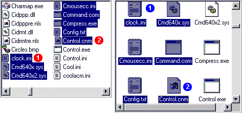 If you really want to confuse your users and make it difficult for them to learn how to use your application, occasionally change the rules under which the controls operate in your application. Explorer does just this in its multiple selection method. Usually, you select a continuous range of items within a list by clicking on the first item, then clicking on the last item in the range while holding the Shift key down. All items between the two will then be selected. This is the standard method of multiple selection in Windows, and the standard method of multiple selection in Explorer as well, as long as you are not using either of the Icon views. In the figure, the left panel represents the List view in Explorer, and the right panel represents the Small Icon view of the same folder. In both panels, the file labeled 1 was selected first, and the file labeled 2 was Shift-selected second. Notice however, that the range of files selected by each is different. When in either of the Icon views, Explorer selects those objects that fall within the imaginary rectangle bounded by the two selected objects. All we can ask is 'Why?': for what purpose would Microsoft make the same selection method yield different results? They switched the rules in the middle of game and here are the likely results:
|
 Back in the days when Microsoft followed their own design standards, there was a rule that you displayed keyboard shortcuts next to the menu item they were associated with. For example, rather than selecting Copy from the Edit menu, you could press CTRL+C to obtain the same result. This was a good way of letting the user know that a shortcut existed.
The designers of Explorer decided against displaying most of the shortcuts, so that most users might never know the shortcuts existed. The only reason we can arrive at to explain this is that Microsoft wanted to give the many authors of "Windows95 Secrets"-type books something to write about (as if they didn't have enough already). For those users who haven't "discovered" these features from some other source, we offer the following:
For Microsoft to have 'forgotten' to include these shortcuts on the menu items they represent is especially shameful, since they led the way in creating this standard. Here's the rule: if you provide shortcuts in your application, let people know about them. Display the shortcut to the right of the menu item it represents. Interesting note: one of the most useful features of Explorer, the "Up one Level" function, which takes you to the next higher level in the hierarchy, can only be accessed by the toolbar icon; not only does it not have a shortcut, it has no menu or keyboard equivalent. Well, that's not entirely true, you can use the following sequence of keyboard commands: TAB + Down + Up + Enter. The responsible party in Redmond was apparently asleep during the design review.
At first, we regarded the practice as being entirely non-intuitive, but a recent letter from Katy Mulvey succinctly describes the problem:
|
 Of course, as is typical in Windows95, getting help for Explorer can be difficult. Microsoft decided against providing a Help file for Explorer. Upon selecting Help, you will be placed in the Windows95 general help file, left to your own devices to decide what it is you need help with, and how to find it.
|
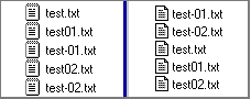 Explorer provides you the ability to sort the list of files by size, date, type, and name, well sort of. Explorer does not utilize true ASCII sorting, and tends to ignore certain characters when sorting the list, resulting in a list that is not appropriately sorted.
The illustration to the right shows two views of the same folder, both sorted by filename. The Explorer list is shown on the left, and the same folder, as displayed by File Manager, is shown on the right. How is it that two applications, from the same software company no less, yield two completely different sets of results, only one of which is correct? As indicated in the illustration, Explorer actually ignores the hyphen character when sorting the filenames. For many users, this may not be an issue, but as indicated in a recent note from Jerry Foster, this "feature" can be quite problematic for some users:
|
 Maybe it was an attempt to make computers more human-like, but we were surprised at the lack of precision in the file sizes reported by Explorer. Rather than reporting the exact size of the file in bytes, Explorer always rounds to the nearest kilobyte (KB). A 1-byte file will be reported as being 1,000 bytes in size. The illustration shows the same files and their sizes as reported by Explorer (on the left), and File Manager (on the right).
As we looked into Explorer's estimation further, we uncovered a number of disturbing problems. Whereas the filelist area of Explorer shows an estimate based on a 1000-byte Kilobyte, the status bar displays an estimate based on a 1024-byte Kilobyte for the selected file. Consider the following figures:
What bothers us most about Explorer's estimation is that the user is not allowed to specify the precision. This would seem to be a perfect candidate for inclusion on the Options dialog: the user could specify actual size in bytes, the actual size in kilobytes, or the estimated size, as currently used. |
 We came across a rather interesting message posted in one of the Windows95 internet newsgroups. We feel that it quite succinctly illustrates one of the problems with Explorer and with Windows95 itself.
At first glance, you might expect that Explorer's Options menu would be the appropriate area to specify Explorer's display characteristics. Unfortunately, the options available under Explorer's Option menu offers very few options. We were able to solve the riddle only by recognizing that despite its outward appearance, Explorer is not really an application, it is an extension of the operating system. Thus, we guessed that we could manipulate Explorer's display by changing the display of the operating system itself. Rather than attempting to change Explorer's settings in Explorer, we found (through considerable trial and error we might add), that the font characteristics of the filenames in Explorer are set by changing the characteristics of, of all things, the desktop icons. Now maybe this makes sense to the folks in Redmond, but it is not without considerable confidence that we can conclude that few users would ever intuitively realize the connection. This is one of the significant problems with Explorer: it has the appearance of a distinct application (not unlike File Manager), but because it pervades all of Windows95, it is an ill-defined application, pieces of which are spread throughout the operating system. The user can, for example, decide against displaying DLL files in the Control Panel, (which cannot display DLL files anyway), and none of the other Explorer windows will indicate that they contain DLL files. Changing the sort order of files in a particular folder will cause the sort order of files in all folders to be changed. Windows95 gives the appearance that a particular file association can be set for a particular folder, but after associating a particular file type in one particular folder, you will find that the association has been made throughout all of Windows95. And as we have seen above, to change the display characteristics of Explorer, you have to go to the desktop and change the settings in an apparently distinct application. The cause of these problems is that Explorer lacks an identity. Without an identity, the user is made uncertain as to where to perform certain operations, and as to the scope of those operations. Now we're not too sure of how many of our visitors will be designing operating systems in the future, but we are pretty certain that the lack of identity makes Explorer a pretty weak and problematic model to follow. |
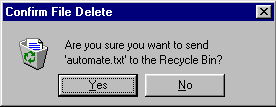 The "file delete confirmation" is further evidence of Explorer's lack of identity, and the problems this can create for the user. Windows95 provides the option of not displaying this message when deleting files. However, this option is not provided in Explorer, but in the Recycle Bin itself. Interestingly, it is not offered under the "Options" menu in the Recycle Bin, but is only accessible by right-clicking on the Recycle Bin, selecting "Properties", then selecting the "General" tab. In all outward appearances, the user must change the properties of another application to change the behavior of Explorer.
What makes this interface fragmentation even more confusing is that the file delete confirmation setting in the Recycle Bin does not apply to the Recycle Bin: dragging a file to the Recycle Bin will not display the message, regardless of the setting. Further, when you decide to "empty" the Recycling Bin, it will still ask you whether you are sure you want to delete the file(s), regardless of the setting. We also found the wording of the message to be problematic. The message uses the phrase "send to", yet the "Send To" submenu in Explorer's context menu does not provide a Recycle Bin option. If one right-clicks on a file, then selects "Delete" from the context menu, the confirmation message refers to sending the file to the Recycle Bin. To actually "delete" a file (that is, skip the Recycle Bin altogether), one must press the Shift key and select the "Delete" context menu option. Performing this latter operation will provide an accurately worded confirmation message ("Are you sure you want to delete 'filename.ext'?), regardless of the setting of the file delete confirmation in the Recycle Bin. The end result of this fragmentation and inconsistency is that it is very difficult for the user to develop an appropriate mental model of the process of deleting a file, and without a means of predicting the operating system's behavior, is left with the uncomfortable feeling of being at the mercy of it. |
 Deleting a file from the desktop provides additional problems for the user. We could envision one additional button on the above confirmation message: I Don't Know.
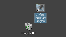
As is indicated by the tiny little arrow in the icon for "A Very Important Program", the icon represents a shortcut to the program. The confirmation message, however, provides no indication that the user is about to delete merely the shortcut (in fact, notice the title of the message). Many new Windows95 users we suspect, (and not a few experienced users), might feel that they are about to delete the program itself, resulting in an icon left on the desktop that the user was afraid to remove.
Deleting a file from the desktop provides additional problems for the user. We could envision one additional button on the above confirmation message: I Don't Know.
As is indicated by the tiny little arrow in the icon for "A Very Important Program", the icon represents a shortcut to the program. The confirmation message, however, provides no indication that the user is about to delete merely the shortcut (in fact, notice the title of the message). Many new Windows95 users we suspect, (and not a few experienced users), might feel that they are about to delete the program itself, resulting in an icon left on the desktop that the user was afraid to remove.
|
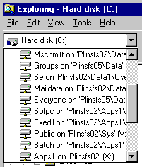 As can be gleaned from this critique, we essentially avoid using Explorer altogether. Therefore, we are grateful to Michael Schmitt for providing an image which encapsulates a handful of interface design problems with Explorer's Go To Folder control:
|
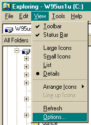
Windows95 instructor Rik Manhaeve wrote in to point out a particularly problematic aspect of the options dialog provided by Explorer:
Windows 95 was designed to be used by people using a computer for the first time. How should they know what MSDOS is, what extensions are, what a path is...? They don't, and these options are very difficult to meaningfully describe to such users. Microsoft should have made a separate section for users moving from MSDOS or Windows 3.11 and put the related issues over there. First time users would see that this is not meant for them to deal with. 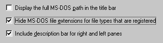
Rik also pointed out another problem with the options: the wording is inconsistent, thereby making the meaning of a checkmark inconsistent. In the first option, a checkmark is positive (display the path). In the second option, on the other hand, a checkmark is negative (hide the extensions). |
| Iain Marshall pointed out a rather amazing example of computer stupidity in Windows 95 Explorer. Iain examined the contents of a floppy disk, then deciding to format the disk (yes, it is possible to format a drive with Explorer, but you have to search around for the means to do so). His attempt was met with the following message: |
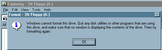 |
| It might be worth noting that the only application that is using the drive is Explorer itself. In order to format the disk, the user must display the contents of some other drive, then right-click on the floppy drive and select Format. |
Visitor Luke Tomasello sent in this image of a message he received from Windows95 when attempting to delete some files from a disk that happened to be write-protected:
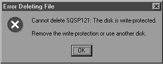 The "write protected" clause in the message is appropriate, but the suggestion to use another disk seems rather curious, since the files to be deleted happen to be on this disk. |
© 1996-1999 Isys Information Architects Inc. All rights reserved.
Reproduction in whole or in part in any form or medium without express written permission is prohibited.
bchayes@iarchitect.com
 The only way to be sure of what will happen when dragging a file is to perform a right-click-and-drag; in that case, Explorer will ask you what you want to do after dragging. The only problem with that is that the right-click-and-drag is perhaps the least intuitive operation ever conceived in interface design. Not only is it physically awkward, it simply would never occur to anyone to even try it.