

Windows95
Until the release of Windows95, Microsoft interfaces had become the standard by which all other applications were judged. Application developers in need of examples illustrating how to resolve a particular design issue could readily turn to any Microsoft application and find the appropriate resolution. However, recent trends suggest that novelty has superseded consistency as the primary rule of interface design.
Last updated 14-Dec-1998
 Applications in Windows 3.1 utilized a well-known standard: You Close a window, and Exit
an application. Experienced users learned that almost all applications could
be terminated with the ALT-F, X keyboard equivalent of selecting the Exit
command from the File menu. As indicated in the graphic however, Microsoft
no longer abides by this standard in many (but not all) of its Windows95
applications, creating a particularly frustrating inconsistency.
Applications in Windows 3.1 utilized a well-known standard: You Close a window, and Exit
an application. Experienced users learned that almost all applications could
be terminated with the ALT-F, X keyboard equivalent of selecting the Exit
command from the File menu. As indicated in the graphic however, Microsoft
no longer abides by this standard in many (but not all) of its Windows95
applications, creating a particularly frustrating inconsistency. |
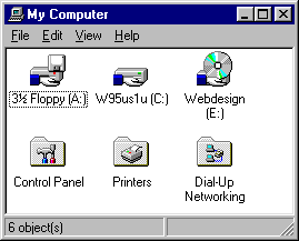 Windows95 is replete with inconsistencies that cause confusion and
frustration. The My Computer folder is one such example. Microsoft considers
it a "special" folder, and therefore unlike all other folders, the user cannot
add files or folders to it, or remove objects from it.
Windows95 is replete with inconsistencies that cause confusion and
frustration. The My Computer folder is one such example. Microsoft considers
it a "special" folder, and therefore unlike all other folders, the user cannot
add files or folders to it, or remove objects from it. There are several such "special" objects in Windows95, such as icons that cannot be removed from the desktop, and windows that do not support drag-and-drop. In interface design terms, "special" means "inconsistent" and "undesirable". |
|
|

|
|
| Inconsistency often seems to be the standard rather than the exception with Windows95. As shown above, the same function could be located in different places within Microsoft's Win95 applications. True to this "standard", items are sorted in Microsoft Exchange by selecting "Sort", whereas items are sorted in Microsoft Explorer by selecting ... "Arrange Icons". |
|
|
|
The taskbar tray then, is not unlike the infamous junk drawer each of us has in our kitchens: a disordered array of odds and ends, that we each proclaim that we'll get around to organizing some day. |
 (Speaking of violating established GUI design principles) Why not? From Microsoft's Window Interface Guidelines: Support drag and drop following the same conventions the system supports: the user presses button 1 down on an object, moves the mouse while holding the button down, and then releases the button at the destination.It would appear that the "conventions the system supports" were not all that clear to those that developed the system. For programming efficiency, Microsoft chose not to support the familiar drag-and-drop metaphor in the Taskbar. The very existence of the error message indicates that the designers knew that the "Drag-and-Hover-and-Move-Then-Drop" metaphor would be a problem, and chose to display an error message instead of correcting the design. |
The "Designed for Windows 95" logo was developed to help end users easily identify hardware and software products that were designed specifically for the Microsoft Windows 95 operating system. Users can mix and match products designated with the Windows 95 logo and be assured that the products will take advantage of the new technologies integrated into the Microsoft Windows 95 operating system....and just as importantly, behave as "good Windows citizens" when it comes to UI, installation and uninstallation.We found it interesting that in the 50 pages of requirements for "good Windows" citizenship, there are only three requirements related to the user interface:
The application must use the system metrics for sizing wherever appropriate. Do not hard code pixel dimensions of menus, scroll bars, sizes of captions, border sizes, etc.It leads one to wonder whether Microsoft was genuinely concerned with "good Windows citizenship when it come to UI...", or whether the Logo requirements program is simply another marketing scheme. |
 While we are on the subject of the logo requirements, we found a number of
examples in which Windows95 itself fails to act as a "good Windows citizen",
and might just fail the logo requirements. The system sizing metrics mentioned
in the requirements are set through the Display Properties dialog. We found
it interesting that the Property Sheet titles, used extensively throughout
Windows95, are not configurable. While the font characteristics of command
buttons in message boxes are configurable, the command buttons used on the
common dialogs and throughout Windows95 are not. Similarly, while the display
characteristics of ToolTips are configurable, the display characteristics
of pop-up help (the "What's This?" messages) is not.
While we are on the subject of the logo requirements, we found a number of
examples in which Windows95 itself fails to act as a "good Windows citizen",
and might just fail the logo requirements. The system sizing metrics mentioned
in the requirements are set through the Display Properties dialog. We found
it interesting that the Property Sheet titles, used extensively throughout
Windows95, are not configurable. While the font characteristics of command
buttons in message boxes are configurable, the command buttons used on the
common dialogs and throughout Windows95 are not. Similarly, while the display
characteristics of ToolTips are configurable, the display characteristics
of pop-up help (the "What's This?" messages) is not. A visually-impaired individual can specify that large fonts be used for window titles, menus, text in message boxes, and the Palette Title (whatever the heck that is), but despite all of the changes, the text in the Windows95 help files and dialogs will always be displayed in 8-pt San Serif font. Of course, if one were to consider a literal interpretation of the logo requirements, Microsoft has not technically failed their own requirements; they just took rather conservative view of which aspects of the interface were "appropriate" for sizing. We just think that a visually impaired user might have a different interpretation. |
 Speaking of the Windows95 Display Properties dialog, we found a great many "programmerisms" that had us stumped for quite a long time. The dialog displays the above image to show various objects in the Windows95 interface, yet offers a combobox control which lists the items contained in the following list as a means of selecting the object to modify: Be sure to check your answers against the actual answers before looking up your rating on the chart below. The actual answers may surprise you.
|

All of the property sheet (a.k.a 'Tab') dialogs in Windows95 provide both an OK button and an Apply button, causing many new users to wonder, "What the heck is Apply and how is it different than OK?" The word 'Apply' is a dubious choice. Other operating systems, and many other applications have used 'Apply' as a synonym for 'OK' and for 'Save'. The Windows95 practice of placing the "Apply" button on the same dialog as "OK" causes instant confusion for new users, and for users of these other systems. As defined by Microsoft, the Apply button is used to save any changes that have been made without closing the dialog box. To the uninitiated user, clicking the Apply button on a dialog such as that shown above has the singular effect of disabling the Apply button, when in reality, clicking the Apply button has two very serious, yet hidden effects:
If the Apply button is used to provide a preview of the effect of the changes the user has made, such as when changing the system color scheme, or when changing the formatting of a document, it would be better labeled "Preview". Even then, the user should be able to simply restore the settings to the pre-preview state by pressing the Cancel button, or a "Restore" button. Through their misapplication of the Apply button, Microsoft has in effect defeated preview functionality, when indeed, such functionality would be very useful. On many dialogs, such as that shown above, previewing the changes would be meaningless, as would saving the changes without closing the dialog, given the simplicity of the dialog. On complex property sheet dialogs, a properly labeled "save this sheet" function would be useful and conceptually sound, provided that a "restore sheet" was also provided. The Apply button, however, is not limited to the current sheet, and instead, commits the changes from all sheets in the dialog. Instead of determining when a properly labeled "Preview" button is appropriate, and determining when an "Apply" button is inappropriate (as shown here), Windows95 uses "Apply" as a generic, though suboptimal function throughout. Its inappropriateness on simple dialogs and the inability to undo its changes leads us to believe that the Apply button reflects a concern for programming convenience rather than usability. |
 The Windows95 common file dialogs (Open File, Save File) offer further proof that proper interface
design is no longer a concern at Microsoft. We are at a loss to explain what the designers were thinking
when they came up with these dialogs. What we do know however, is every time a new computer user is
presented the Windows95 common file dialog, he or she is at a loss as to what the heck is going on.
The Windows95 common file dialogs (Open File, Save File) offer further proof that proper interface
design is no longer a concern at Microsoft. We are at a loss to explain what the designers were thinking
when they came up with these dialogs. What we do know however, is every time a new computer user is
presented the Windows95 common file dialog, he or she is at a loss as to what the heck is going on.
There are so many problems with the standard file dialogs that we've added a separate page to contain them. |
 One of the new "features" of Windows95 is the menu-type command button; that is, a command button that displays a menu when clicked. The most notable example is the Windows95 Start Button. OK, we'll concede that the Start Button is a special case. Unfortunately, the menu-type command buttons are used elsewhere in Window95.
The problem with the menu-type command button is that it does not operate like a command button. When the user is expecting a window to open, having a menu displayed is simply disconcerting. Interestingly, there's no mention of the menu-type command button in Microsoft's Windows Interface Guidelines for Software Design. We think this is because the people who wrote the guidelines never expected anyone to abuse the command button in this manner. After all, the command button has two purposes in Windows: perform a direct function, as Print, and open a window, as in Open....
Microsoft's interface group wrote the guidelines to ensure consistency in Microsoft's apps; unfortunately, Microsoft's developers didn't bother to read them. |
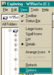
 Here's an example of how the object oriented nature of Windows95 breaks down. Select Options from the View
menu of the Control Panel, and you presumably are provided the ability to
selectively chose which types of files will be displayed. Unfortunately,
this is meaningless, since the control panel only displays a single, special
type of files (.CPL) files. Changing these properties will have no effect
in the Control Panel, but they will affect the display characteristics of
the Explorer, and all folder displays in Win95.
Here's an example of how the object oriented nature of Windows95 breaks down. Select Options from the View
menu of the Control Panel, and you presumably are provided the ability to
selectively chose which types of files will be displayed. Unfortunately,
this is meaningless, since the control panel only displays a single, special
type of files (.CPL) files. Changing these properties will have no effect
in the Control Panel, but they will affect the display characteristics of
the Explorer, and all folder displays in Win95. (For more on the Display Files option, see the Interface Stupidity section) The Control Panel is yet another "special" object in Win95; it is a special type of Explorer display. Just to confuse the user, Microsoft made it look just like an Explorer folder, but they made sure that it doesn't operate like one. |

To create a new folder on the desktop, right-click on the desktop, then select New...Folder. To create a new folder within a folder, right-click on the folder, then select New...Folder. To create a new folder in Explorer, right-click on the Explorer pane, then select New...Folder. To create a new folder in Microsoft Exchange, right-click on ...Oops, silly us, select New Folder from the File menu. Who needs standards anyway? |
|
|
 |
| The fact that Microsoft has made an unwieldy cascading menu the centerpiece of their new operating system convinces us that their Usability Lab no longer employs interface designers or human factors engineers. In their Windows User Interface Guidelines, Microsoft explicitly states that cascading menus should be avoided, and if used, should not be more than 2 levels deep. Yet the major interface feature of Windows95 is a screen-size cascading menu that is often 4 or more levels deep and causes such large and rapid visual changes that it is likely to cause seizures among its epileptic users. |
 One of the most notable inconsistencies in Windows95 is the fact that
the Start Menu, unlike all other controls, does not support right-click context
menus. One cannot, for example, determine the actual location of the application
from the start menu. To change the contents of the menu, the user must start
a different application. At a minimum, one would expect that right-clicking
on the Start button itself would allow you to change the menu structure or
properties. It is odd though, that the Start Button is one of the only Win95
controls that doesn't offer a Properties option from the context menu.
One of the most notable inconsistencies in Windows95 is the fact that
the Start Menu, unlike all other controls, does not support right-click context
menus. One cannot, for example, determine the actual location of the application
from the start menu. To change the contents of the menu, the user must start
a different application. At a minimum, one would expect that right-clicking
on the Start button itself would allow you to change the menu structure or
properties. It is odd though, that the Start Button is one of the only Win95
controls that doesn't offer a Properties option from the context menu. For the advanced user, the ability to change the structure of the menu
by dragging-and-dropping from within the menu would be far more efficient
than calling Explorer. For the new or casual user, the ability to
delete, move, or add items from the context menu would have been consistent
with the rest of the operating system, and therefore far more intuitive than
selecting |
 Do you dislike the fact that you cannot change the order of the items
in the Start Menu? An alphabetized order is better than no order at all,
but a user-configurable order would be best of all. Users could, for example,
place the programs they use most often at the top of the menu, or display
programs before
folders within a folder. Unfortunately, despite the many configurable options
in Win95, the ability to configure the menu according to your needs and preferences
was not offered.
Do you dislike the fact that you cannot change the order of the items
in the Start Menu? An alphabetized order is better than no order at all,
but a user-configurable order would be best of all. Users could, for example,
place the programs they use most often at the top of the menu, or display
programs before
folders within a folder. Unfortunately, despite the many configurable options
in Win95, the ability to configure the menu according to your needs and preferences
was not offered. Interestingly, the director of Microsoft's Visual Design Group didn't appreciate this omission as well. In an article in the March '95 issue of Visual Basic Programmers Journal describing the interface of the soon-to-be released Windows95, Virginia Howlett included a photograph of the Start Menu, a portion of which is replicated here. Notice that to rearrange the menu according to her personal preferences, she had to resort to using a special character to fool the menu into her preferred order. Not surprisingly, the text of her article failed to mention this limitation, nor her clever workaround for it. Users should not have to spend time contemplating clever workarounds for system limitations. Nor should they have to include meaningless punctuation and symbols in folder names to fool the operating system. The operating system should have been designed to accommodate the users needs. We recently came across the following message in one of the internet newsgroups. This is a pet hate of mine... Microsoft went to extraordinary lengths to add Property sheets to everything they could think of so that we could make things the way we like them. They even threw in multiple users so that we could have different people configuring things for their individual tastes. We can make the colours as gaudy as we like; we can add sound effects (God forbid) to go with our animated minimizing windows; and, just for kicks, we can make the mouse pointer look like Darth Vader's lightsaber. But somehow the Microsoft boys have this notion that the entire world lives to see everything alphabetized.Side note to Dale: if you are ever interested in writing for the Interface Hall of Shame, let us know - you've got the right stuff. |

|
| Of course,
once you have used all the various tricks to get the Start menu in an acceptable
order, and have become used to a particular sequence of mouse movements to
access a particular file, installing a single application can throw a wrench
into the works. Since we update this site very frequently, the sequence of mouse movements above has become quite familiar. Unfortunately, after installing a single program, the sequence can drastically change, as shown below. |

|
| Part of the responsibility for this problem lies with the developers of the installation programs, who often do not provide a means for the user to select the StartUp folder into which the shortcuts should be placed. But most of the responsibility lies in the design of the Start Menu itself, especially the fact that it is launched from the bottom of the screen. Each installation of a program can have drastic effects on the layout of the start menu, making it nearly impossible for the user to learn consistent techniques for accessing a desired program. |
 Of course, as a way of understanding the eccentricities in Windows95,
the new user could turn to the Help file, right? Not likely. The new user
turning to help is first presented a hierarchical list control, one of the
most confusing of all Windows controls, as it offers no visual clues as to
how it works. To the new user, it is simply a list. Click on an item on
the list and hit Open, and surprise, you are rewarded with another list.
The hierarchical list is so non-intuitive, Microsoft had to post instructions
above it. The need to post instructions is a good indication that it is
improperly designed.
Of course, as a way of understanding the eccentricities in Windows95,
the new user could turn to the Help file, right? Not likely. The new user
turning to help is first presented a hierarchical list control, one of the
most confusing of all Windows controls, as it offers no visual clues as to
how it works. To the new user, it is simply a list. Click on an item on
the list and hit Open, and surprise, you are rewarded with another list.
The hierarchical list is so non-intuitive, Microsoft had to post instructions
above it. The need to post instructions is a good indication that it is
improperly designed. The Open button expands the list to show the categories subsumed under the selected item. "Open" then becomes "Close", until the user selects a different item in the list. This last "feature" is in direct contradiction to Microsoft's design standards for Windows 3.1; at the time, they realized that changing the captions on a button might confuse new users. Maybe new computer users are more computer-savvy these days. One of the first items in every Windows 3.1 help file was an instruction on how to use the help system. This topic exists in the Windows95 help system, but it is buried in the hierarchy: it's the last topic in the How-To section. Go figure. Watch out for that Print button. New users might be tempted to click on an item in the list, then hit Print to obtain a printout of that item. Not all that far-fetched. But if you click on one of the items listed and hit Print, you better make sure your printer has plenty of paper - you'll get a printout of all help topics contained in that category. Print has no place on this window - its inclusion on this window is only an invitation to confusion and wasted paper. A help system should be the single most usable aspect of any application or operating system. The help system in Windows 3.1 is far more intuitive and usable. |
 Visitor Steve Sampson informed us about an extremely serious bug in the Windows95 Data/Time Applet. On this particular dialog, changes to the date are accepted as they are entered,
causing an immediate change to the system date, without the user's having
selected the OK or Apply buttons. Equally surprising is that changes to
the system time are not immediately accepted. Visitor Steve Sampson informed us about an extremely serious bug in the Windows95 Data/Time Applet. On this particular dialog, changes to the date are accepted as they are entered,
causing an immediate change to the system date, without the user's having
selected the OK or Apply buttons. Equally surprising is that changes to
the system time are not immediately accepted. Many users rely on the Date/Time Applet as a calendar to look up dates and days of the week. Because of this improper design, such users are opening themselves up to severe system problems. Any system activity made during the time the applet is open will be assigned the date in the control, rather than the actual date. Files could be assigned improper dates, backup programs and other scheduled activities could fail, limited-use shareware could inexplicably stop working, and a variety of other serious problems could follow. This is a serious bug, one which has been described to exist in a variety of Windows95 versions. The bug can be verified by opening the applet, changing the date (just a day or so), then, without selecting the OK or Apply buttons, hold the cursor over the clock in the system tray. The tooltip will display the date the system believes is correct. If further verification of the consequences of this bug is desired, create a junk file in any editor, save it, then check the date in Explorer. |
© 1996-2000 Isys Information Architects Inc. All rights reserved.
Reproduction in whole or in part in any form or medium without express written permission is prohibited.
GP designpartners provide this mirror — for educational purposes only — as the interface hall of shame is no longer maintained or available at its original home, www.iarchitect.com [a domain apparently abandoned and taken over by a search spammer ...].
you can view this file in its original layout: msoft.htm.
please drop us a line if you happen to know anything about the whereabouts of brian c hayes of isys information architects, the author of this »interface hall of shame« [and fame].
