
| June 4, 2000 |
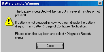
Frans de Haan sent in this image of a message provided my MTC Diag, a power management application that is provided with Saxum 8004 notebook computers. The intent of the message is to alert the user that the batteries are nearly depleted, but somehow, that message doesn't entirely come across to the user.
 |
| Abbagail Winters send along this image from BatchIt Pro. Despite the designer's attempts to organize the dialog, that organization may be entirely meaningless. |
 |
|
From the BatchIt Pro help file (emphasis added): The Configuration screen is made up of 4 sections. They include Resizing Settings, Text Caption, Watermark and the Saving Option...Although this has nothing to do with Resizing, the Image Orientation option allows to do a mass rotation of all the images... |
| Owen Rudge sent in this bizarre message from Microsoft's Outlook Express 5.0: |
 |
I was using Microsoft Outlook Express 5 and I went into the Deleted Items. To my surprise I found a message stating that there were no items in the Deleted Items folder and do I want OE to delete something. What sort of a message is that?!? Why would I want OE to delete a randomly-selected piece of mail? I didn't try and find out what it would delete, I just pressed No immediately! |
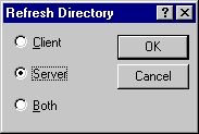 Bo Bichel Nørbæk discovered this dialog in Reflection FTP after hitting the F5 key to refresh the file listings. Understandably, Bo asks: "WHY THE
#%&?# CAN'T REFLECTION JUST GO AHEAD AND REFRESH BOTH LISTINGS INSTEAD
OF PUTTING UP THIS STUPID DIALOG BOX?!!!" Bo Bichel Nørbæk discovered this dialog in Reflection FTP after hitting the F5 key to refresh the file listings. Understandably, Bo asks: "WHY THE
#%&?# CAN'T REFLECTION JUST GO AHEAD AND REFRESH BOTH LISTINGS INSTEAD
OF PUTTING UP THIS STUPID DIALOG BOX?!!!"
|
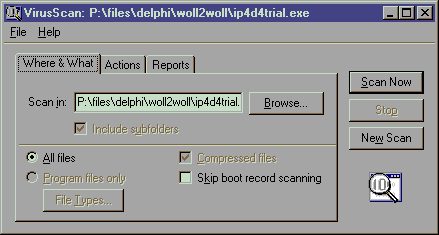
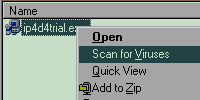 Ken Rachynski asks a similar question of Network Associates' VirusScan. The program adds an item to Explorer's context menu to allow the user to scan the selected file or folder. However, rather than performing the scan, the application pops up a dialog box asking if the user wants to Scan Now? Ken Rachynski asks a similar question of Network Associates' VirusScan. The program adds an item to Explorer's context menu to allow the user to scan the selected file or folder. However, rather than performing the scan, the application pops up a dialog box asking if the user wants to Scan Now?
 |
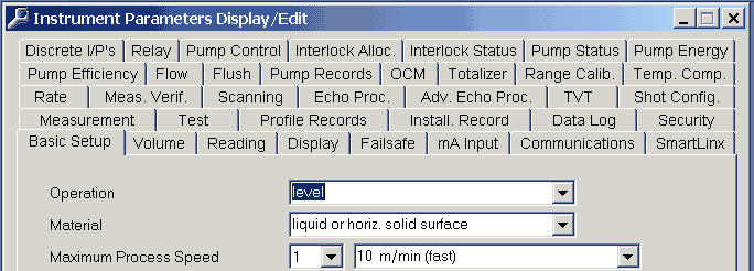
| An anonymous visitor sent in this image from Milltronics' Dolphin Plus, a configuration package for industrial level and flow sensors, as a candidate for the Tabbed Dialog Hall of Shame: |
 |
|
Where's Waldo? |
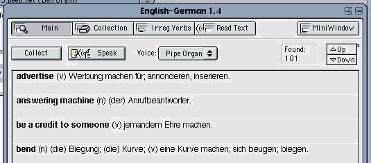
| Ben Oram sent in this image from English-German from OneApp Software. |
 |
|
The image reveals a number of interface problems related to the program's failure to adopt the MacOS interface design guidelines, but one in particular is worthy of special mention. The purpose of the dialog is to display a list of matches for a given word, yet despite the number of matches (101 in this case), the program does not display a scroll bar. Instead, the program employs a custom control comprised of Up and Down buttons, and a tiny "speck" to indicate the user's relative position in the list. When one considers the amount of functionality provided by a standard scroll bar, the decision to replace it with a far less functional custom control is particularly shameful. In addition to being able to scroll up and down a line at a time, a standard scroll bar also allows the user to page up and down, and to grab the scroll indicator and drag it to the desired position. Further, the standard scroll indicator is far more visible and indicative than what appears to be nothing more than a few misplaced pixels. |
| April 2, 2000 |
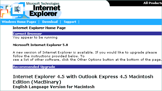
It would appear that Microsoft's Artificial Intelligence Division has been at it again. Pierre sent in this image of the web page he received when he visited http://www.microsoft.com/ie:
Could this be a realization that IE4.5 is somewhat better than IE5.0? |
|
|
|
Rick Lamoreaux sent in this image he received when attempting to add files to a project in Microsoft's Visual Source Safe . 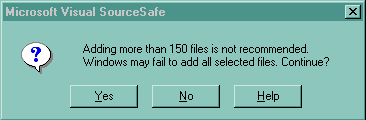 As Rick pointed out, the message does not inspire much confidence in the software, and seems to be not so much a warning as a CYA hedge just in case something goes wrong. The message, "This might not work, are you sure?", seems to be a means of transferring responsibility for the program's failure to the user. |
Gary Walker received the following message after accidentally deleting several lines in Microsoft's SQL Server 6.5 -- Enterprise Manager.
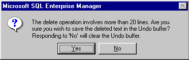 If you select more than 20 lines of text from the query window, and then accidentally hit delete, you get this apparently helpful error message, so that if you change you mind, you can hit "No" to avoid the delete. However, closer inspection of the message reveals a glaring inconsistency. Hitting "No" actually causes the Delete operation to continue, but destroys the Undo buffer in the process, leaving no means of canceling an accidental delete. |
Søren Erland Vestø sent in this image he received from the otherwise excellent freeware hex-editor A.X.E.:
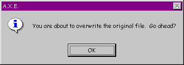 Søren received the message upon accidentally saving (via CTRL-S) a document he had opened but not edited. Beyond the fact that the dialog providers no means for the user to convey, "No it's not OK", one has to wonder why the message exists at all. |
When installing Office 2000 recently, David Nottage discovered that Microsoft's developers still haven't learned how to write a meaningful error message:
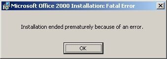 The message is entirely unhelpful, giving no indication of what the error is, what to do to solve it, or even the location of an error log if one existed. Welcome to Windows David. |
Steve Dieke sent in this image illustrating the Minimalist school of tab design used in Novell GroupWise 5.1:
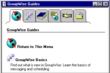 In addition to the disconcerting lack of Gestault, the design suffers from a number of other important problems. Most notably, the pictures on the tabs make little sense. Recognizing this, the developers felt compelled to add a glossary tab (shown) merely to provide an explantion of the images. Unfortunately, if you have moved off of the glossary tab, you lose the explanations. While tooltips should not be considered an appropriate solution to the use of unclear icons, they certainly would have helped here, if Novell had thought to provide them. Better yet, textual labels would have negated the need for a glossary and tooltips. |
Timothy Tan discovered the following catch-22 in Microsoft's Word 97. When doing a spell check for a document set with the language
as "English (British)", the spell check informed him that the word "worldwide" is not in the dictionary and offered to change it to "world-wide".
 Tim accepted the application's offer to change the offending word, only to find that Word 97's grammer checker considers the word "world-wide" to be a compound word that would be better written as "worldwide". 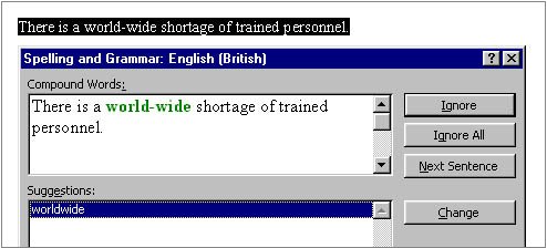 Tim discovered that the only way to solve the problem is to add the word "worldwide" to the custom dictionary, or use the "English (American)" dictionary. |
Greg Funk sent in this rather perplexing problem he discovered with Microsoft's Internet Explorer 5.0 FTP application:
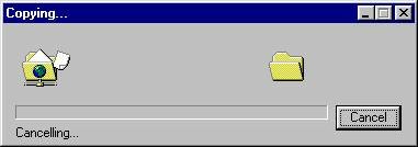 The problem is one that could keep the more philosophically-minded computer users debating at great length: What happens when one cancels the operation Cancelling [sic]? Greg points out that the scenario can be recreated in the following manner:
It should be noted that the operating is not canceled when requested. Greg eventually had to hit the close button in the upper right corner. In his own words, Greg "canceled out of canceling the canceling by hitting the close box." |
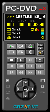 Of all the possible real-world objects that one could select as the basis on which to model a software user interface, I do not believe that one could make a more ill-advised decision than to select a hand-held remote control. Unfortunately, Creative Labs did just that with their design of their Creative PC-DVD application.
Visitor Ilari Sani sent along images and a thoughtful critique of the resultant design, which provides further additional evidence why the software industry should adopt a zero-tolerance policy against the use of real-world metaphors. Additional detailed critiques of real-world interface metaphors in the Hall of Shame include:
These reviews reveal a number of important axioms for those contemplating a real-world design metaphor:
Just say No to real-world metaphors. |
| February 28, 2000 |
|
Zing Zing Awungshi Shishak suggested that I take a look at Yamaha's SoundVQ player as a potential candidate for the Interface Hall of Shame. I didn't bother to look much farther than their Open File dialog, a portion of which is displayed here. 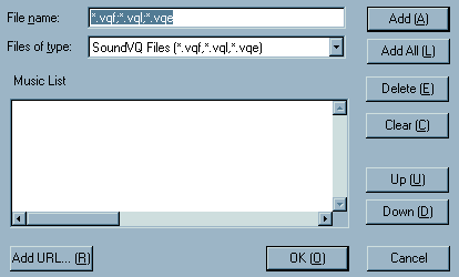 Have any of the SoundVQ developers ever seen a Windows application? |
Tom Campbell received the following message while trying to check out and edit a file in Revision Master.
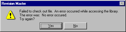 As Tom quipped: In an odd way, such a self-contradicting message is conceptually artistic. There is tension between the two different spellings of "occurred." And an error message stating there's no error has a zen symmetry that's at once perplexing and graceful. |
Jean-Marc Orliaguet provided evidence that messages warning of success are not restricted to the Windows operating system. The following message was generated by the NetInfo configuration program running on the Mac OS X Server.
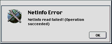 The only real difference between the message on the two operating systems is that the Mac OS X server feels that it must convey a much greater sense of urgency and alarm! |
Søren Vestø found the following problem when trying to install the Microsoft Developer Network.
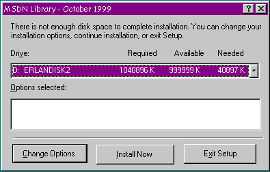 The problem is that the display of Available Memory maxes out at 999999K, even though Søren swears that there was 2.4 GB available. Interestingly, despite the fact that the program has concluded there is not enough memory, it allows the user to proceed, successfully, in fact. |
Rich Adams was understandably full of questions when trying to uninstall ICQ.
 And....order a pizza? Reformat the hard drive? What? |
|
|
This wonderful example of bad design was contained in the tutorial for Mosaix, a customer support application popular with mega-corporations:
 A competent developer might have recognized the absurdity of the message and simply disabled the offending 'Glossary' button. The tutorial however, does not appear to be the product of the Mosaix development team. Rather, it appears to be the product of MediaPros, a company specializing in computer-based tutorial design, as indicated in this success story posted on the company's website. With an opening message like this, MediaPros may want to reconsider the tutorial as an example of their design abilities. |
Richard Sheridan provided a couple of images illustrating some further evidence against the use of real-world metaphors in interface design. Both images come from AudioRack 32, a multimedia application packaged with his Hewlett-Packard computer.
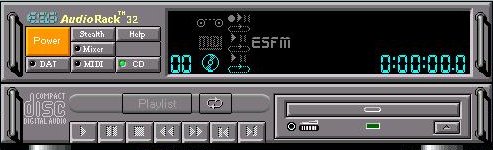 ...like IBM's "Real CD", Audiorack actually looks like a CD-Player, and is hideously incongruous in the subtle, soothing Windows environment, like someone turning up dressed like Big Bird to a formal dinner. Yet, since the designers seem obsessed with the form itself, let's be fussy: it's odd that there is an ugly space next to the "Mixer" button. What else? I particularly like the button called "Stealth". Everyone else on the planet would call this "Minimize", and it would be placed top right-hand of the form. In fact, the tooltip does say, "Enter miniature mode". Then note all the cute LCD symbols on the display panel. Any idea what they mean? Who cares? The second image was even more revealing. AudioRack 32 used its own custom "Rack Control" to allow the user to scroll through additional controls that are as yet hidden from the user: 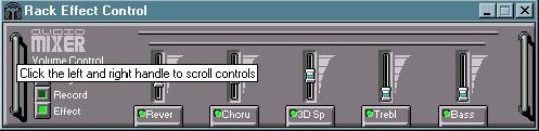 As Richard noted, the Rack Control seems specifically designed by very artistic people to prevent easy usage. Richard had no idea that other controls were available; he discovered the "feature" when he accidentally left the mouse cursor over one of the "handles". |
| February 3, 2000 |
Martin "Jay" Sundstrøm sent in a couple of images indicating localization problems with the Danish version of the MacOS 8.6 operating system.
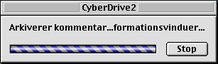 The OS wanted to say "Arkiverer kommentarer i informationsvinduer" (Saving comments in info-windows), but by not providing adequate space, the designer of the window gagged the OS before the message could be completed. When attempting to restart the OS, Danish users are presented with the following message: 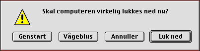 In English-language versions of the OS, the user can press the "R" key on the keyboard as a shortcut for the "Restart" button. Unfortunately, Danish users as well must use the "R" key as a shortcut for restart, despite the fact that the Danish word for Restart is "Genstart". |
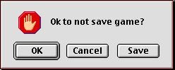
Chris Kostiw sent in this image, taken from the Mac shareware version of Risk. The image is displayed if the user attempts to quit the game without saving. The Mac UI guidelines eshcew the use of Yes and No responses in dialogs; here's why Apple should change the guidelines:
 |
James "Kibo" Parry sent in this image taken from Apple's SimpleText. The dialog thoughtfully provides a text box into which the user can type a search term, but before he or she can use the search box, it must first be unlocked, by clicking the arrow button. 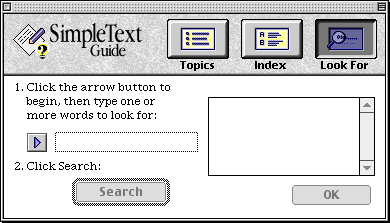 It would appear that the designer felt that the user must be protected from accidentally entering text in the search box. |
This example of meaningless GeekSpeak was discovered in Adobe's ImageReady by Joanna Southerland:
 |
Avery Lee sent in this image provided by Intel's VTune 4.0 performance tuning tool. Avery discovered the message when he I tried to invoke the 'code
coach' on an assembly language file, only to discover that VTune only understands C/C++, Java, and Fortran:
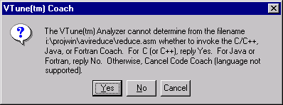 Somehow, the developer's inability or unwillingness to design an appropriate dialog box doesn't inspire a great deal of confidence in his or her ability to perform performance tuning. VTune provides another example of questionable competence in its non-progress dialog, as shown in the following animation: 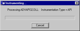 |
| Michael Wilson sent in this example of programmer verbosity that he was confronted with when he tried to view Midwest Microwave's online catalog at http://www.midwest-microwave.ltd.uk/index.htm. |
 |
| One has to wonder why all that information was loaded into a transitory message box rather than simply including it on the web page itself. |
James "Kibo" Parry sent in an image of an error message he received when trying to register with American Airlines' Web site:
 Kibo simply typed "W." (not ".W." and not "-.W.-") when asked for his middle initial. Apparently, either the "W" or the "." is considered an "invalid special character". Kibo didn't realize that he could only type "characters". |
| Less-recent additions... |
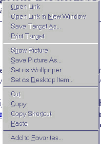 Eric Hartwell highlights a notable problem with the design of the context menus Internet Explorer. Eric often avails himself of the 'Save Image As' menu item to copy images from web sites. Unfortunately, the 'Set as Wallpaper' menu item is located immediately below the desired menu item, making it a likely inadvertent target. The problem is that 'Set as Wallpaper' acts immediately and irreversibly; the application does not first prompt the user, as is the case with the menu items immediately before and after it, so there is no way to cancel the action. If the 'Set as Wallpaper' item is inadvertently selected, the user will have to go somewhere else and perform a series of actions to undo the effects of the unintended action.