
|
Tabbed dialogs are great. They allow the designer to organize information, and provide an intuitive means of navigating that information. In the hands of a misinformed or mis-intentioned designer however, the tabbed dialog design strategy can make it all too easy to create inefficient and confusing dialogs. Last updated 4-April-2000 |
 |
|
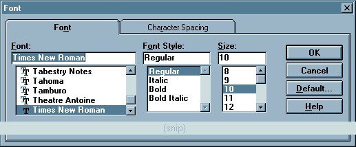
This Font dialog in Microsoft Word 6.0 illustrates one of the earliest criticisms of tabbed dialogs. By placing the command buttons on the tabs themselves, the user was often confused as to the consequence of selecting the buttons. The placement of the buttons seems to indicate to the user that he or she must click the OK button after making changes to any tab before moving on to the next tab.
In time, designers recognized that if the command buttons were placed outside of the set of tabs, the user would correctly consider those buttons as controlling the entire set of tabs, as shown in the Properties dialog from the Windows 95 version of Microsoft Word: 
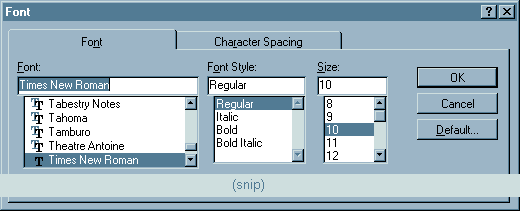
Microsoft adopted this new button placement strategy throughout Windows 95, but unfortunately, chose not to correct the known problems in its Office Suite of applications. For example, aside from minor cosmetic changes, the Font dialog in the Windows 95 version of Word is essentially no different from the earlier version: |
 |
| Tabbed dialogs can also make it difficult for the user to know when their changes will take effect. Most tabbed dialogs follow the rule employed with standard dialogs: changes take place when the user selects the OK button. The Options dialog of Microsoft's Word 6.0 sporadically follows this rule: several options were specifically programmed to take effect when the user switches to a different tab. |
 |
|
For example, in the group of "Show" options, all of the options except the Picture Placeholders option will take effect when the user switches to a different tab. In addition, when the user switches to a different tab after changing any of these option, the Cancel button changes to Close. This latter "feature" means that these changes cannot be cancelled without manually resetting them to their original values. Other options on this tab and on other tabs in the dialog are subject to this inconsistent application of the rules, and these inconsistencies were carried into later versions of the Office suite of applications.
Such inconsistencies prevent the the user from anticipating the behavior of the application, make it more difficult to learn how to use this and other applications, and make for an uncomfortable computing experience. |
| In Word 6.0, Microsoft attempted to increase the utility of the tab metaphor by increasing the number of tabs in the dialog. Unfortunately, this increase in utility resulted in a serious decrease in usability. In effect, the designers took a good idea and extended it to the point were it negated any benefits it made possible. |
 |
|
The sheer number of tabs in the dialog intimidates new users, and makes it difficult for the user at any experience level to locate a particular tab of interest. The arrangement of the tabs does not appear to be based on any meaningful construct. Visually, the additional rows of tabs contributes to a cluttered appearancee. Instead of a single tab object, there are now three tab objects, each consuming real estate with unnecessary visual distractions. The most important problem is that clicking on a tab in any of the back rows causes a disconcerting rearrangement of the tabs. The selected tab jumps to the front, but the cursor is left pointing at an unrelated tab, drawing the user's attention away from the tab of interest.
In her book, GUI Design for Dummies, Laura Arlov presents some important advice: One row of tabs is enough. Again: One row is enough. And once more: One row is enough. |
| Many developers seized upon Microsoft's use of multi-row tabbed dialogs, believing, "Microsoft does it so it must be OK". Some took this mistaken approach and found a way to make it even less usable, as indicated in this illustration from Webforms by Q&D Software Development: |
 |
| Because the number of tabs per row varies, clicking on one of the tabs from other than the front row causes a major reorganization of the entire set of tabs. Tabs switch positions not only front to back, but also left to right, leaving the user in a state of utter confusion. |
| In Zoc, a communications program from EmTech Innovative Software, the developers took the tabbed dialog approach, added multiple rows, and varied the number of tabs per row: |
 |
|
The design is compromised even further by the fact that there are multiple tabs for each of several functions (e.g., Device and Device-2, Window and Window-2, etc.). The fact that some of these tab groups are split onto different rows is particularly disconcerting (e.g., Modem and Modem-2).
To see why this arrangement is so ill-advised, try to count the tab pairs in the above image. Then try counting them again. Our bet is that it will take several tries before you can confidently state the number of tab pairs. Innovative indeed. |
 Paul sent us this image of the Options dialog from MultiEdit 8.0. To date, we consider this the definitive example of how not to design a tabbed dialog. The sheer number of tabs, combined with the use of iconic labels and the gratuitous use of graphics on the tabs themselves results in a veritable visual assault. Once your eyes recover from the initial assault, you may be able to spot another problem: the use of nested tabs (note that two separate tabs on the dialog are highlighted). MultiEdit's creator, Todd Johnson, wrote to us to state that the design of the options dialog was dictated by the complexity of the program: We have a complex product with a LOT of configurablity, so we end up with a complex configuration dialog, there really isn't anyway around that.Actually there is. We've put together the following animation to illustrate one alternative design:  The alternative offers a number of important advantages over the existing design:
While it is our belief that the proliferation of configuration options in MultiEdit has far exceeded the point of diminishing returns, the alternative design offers one important additional benefit:
The result is a cleaner, more parsimonious dialog in which the user can much more rapidly locate and navigate to the information of interest. |
Based on the novel tabbed dialog used in Microsoft's Visual SourceSafe 5.0, it would appear that at least some of Microsoft's developers have found multi-row tab displays to be problematic. Unfortunately, the alternative leaves a great deal to be desired.

Since the SourceSafe properties dialog provides more tabs than can be displayed in a single row, the developers elected to use a scrolling tab control. The arrow controls on the right edge of the tabs allow the user to scroll through the tab captions. Interestingly, scrolling through the tab captions does not change the current tab, it just allows the user to see those tabs that are otherwise hidden. The notion of hiding tabs from the user has to be among the most ill-advised design strategies one could possibly conceive. The strategy forces the user to take actions (four mouse-clicks in the above illustration) just to determine which types of properties are available, and moreover, requires another four mouse-clicks to get back to the beginning after exploring the dialog. Hopefully, modifying the options on the last tab in the dialog will be a very infrequent process. Microsoft employs this strategy in a number of its development tools, and has built methods into those tools for developers to add it to their own applications. This will undoubtedly cause the proliferation of this truly shameful design strategy, one which would never have survived even the most casual usability testing. |
 The purpose of tabbed dialogs is to present related information in an organized manner. One advantage of the tabbed dialog is that it provides the user an overview of the contents of the dialog. Thus, it is important that the categories, or tabs, be somewhat related to each other. The purpose of tabbed dialogs is to present related information in an organized manner. One advantage of the tabbed dialog is that it provides the user an overview of the contents of the dialog. Thus, it is important that the categories, or tabs, be somewhat related to each other.
This is not always the case. The following dialog is presented in response to the user's having selected "Add/Remove Programs" from the Windows 95 Control Panel: 
Of the three tabs, only "Install/Uninstall" seems relevant to the function (one has to wonder why Microsoft did not use the terms "Add/Remove" for this tab). While "Windows Setup" technically involves the installation and removal of programs, the phrase seems to imply the setting of system configuration parameters; it does not appear to be conceptually related to the process of adding and removing programs. Finally, there is no arguable relationship between creating a "Startup Disk" and the installation and removal of software. As with "Windows Setup", the user would never think to look for this function under the title "Add/Remove Programs". The "Add/Remove Programs" dialog seems to be an example of the Available Space Metaphor described on the Metaphors section of our site. Specifically, it would seem that the "Windows Setup" and "Startup Disk" functions were placed on the dialog simply because there was space available on the dialog. |
The Windows 95 Find Applet is critically examined in the In-Depth section of the Interface Hall of Shame, but a portion of that discussion bears repitition here. Specfically, the applet illustrates the use of tabs where such use is not indicated, and how the misapplication of the tab metaphor can indeed decrease the usability of the application.
 Tabs reduce clutter in complex windows by organizing the information into discrete sections. The information in the Find dialog however, is neither complex nor cluttered, nor do the imposed sections reflect distinct sections. In fact, similar criteria are entered on separate Tabs, creating a conflict for the user. One point of conflict imposed by the Tabs is the type of files to be searched. The user could specify the file type by entering a file extension and wildcard for the 'Named' field on the "Name & Location Tab", or could select one of the file types from the 'Of type' drop-down on the Advanced Tab. Changing one of these fields causes the other to change, but because they are placed on separate Tabs, this change is not visible to the user. Regardless of the criteria specified in the 'Named' field, 'Of type' will read 'All files...'. Changing the 'Of type' has the effect of deleting the user's earlier file name specification. The end result of all this is that the user is confused as to which files are being searched for. The appropriateness of the term 'Advanced' is dubious at best. Is searching for a string of text in files really an advanced feature? The likely result of the 'Advanced' label is that some users will be intimidated from ever exploring the Tab. Since the dialog offers very few criteria, there is no reason not to provide them in a single location. Such a design would allow the user to instantly see the various criteria and would prevent conflicts between visible and invisible criteria. |
| Occasionally, you find people employing tab controls for unusual reasons. This example, taken from Mountain Menus by Lone Wolf Software, shows the use of tab controls to present a menu of toolbar buttons: |

|
|
Part of the problem here is that the toolbars do not necessarily reflect the menus they are intended to augment. While the "View" toolbar, for example, replicates the functions available in the "View" pulldown menu, the "System" toolbar consists of some of the menu items from the "Configure" pulldown menu, and some from the File pulldown menu. At the very least, the distinctions made in the toolbar tabs make it more difficult for the user to develop associations between the toolbars and the menus.
One has to wonder however, what possible benefits one can gain by placing toolbars in a tabbed arrangement. Lone Wolf Software claims that the arrangment allows them to present more buttons than can normally fit on a window, and moreover, that they can create bigger buttons without running out of real estate. By placing representations of menu items within tabs however, the developers have simply created a duplicate menus. Toolbar buttons are intended to provide single click access to frequently used menu items. If the toolbar button is within a tab, the user is essentially performing the same action as that provided in the menu. Any possible benefit, if any, provided by this strategy is offset by the difficultes created by inconsistent grouping of items between the tabs and the original menus. |
| This unusual application of the tabbed dialog metaphor was discovered in Contact Master, a contact management application developed by Bytemasters. Whereas the application makes appropriate use of tabs in other areas, in this particular dialog, tabs are used to ... sort database records: |

|
|
The selection of any tab in the dialog will cause the list of records to be sorted according to values in the associated column. Moreover, the arrangement of the columns will change, such that the sort column is always placed in the first column.
The inconsistent application of the tab metaphor is noted in the application's help file, which offers the following definition for the term "tab" (emphasis added): A common navigational tool used in Contact Master is the tab. Tabs allow you to instantly change the display order of data in a list box or access multiple pages on a form. Tabs are a navigational aid; they help to organize information and provide rapid access to that information. By imbuing tab controls with magical powers, Bytemasters has created inconsistencies not only within the application, but between tab controls in Contact Master and tab controls in every other application. Not surprisingly, the misapplication of the tab metaphor unnecessarily restricts the utility of the application. Specifically, the user is only allowed to sort records on a single field, and further, the tab-sort method provides no means for the user to change the column order of the fields. |
This gratuitous use of the tab metaphor was discovered in MediaBlaze 98, a multimedia viewer application that was inexplicably granted a 5 Cows rating at TUCOWS:
 The first four tabs are used merely to change the type of files displayed in the (unlabeled) directory of files. The "MediaAgent" tab displays a search function to locate files on the user's computer. Interestingly, on the MediaAgent tab, standard option buttons are provided to allow the user to specify the type of files to be located. The "About" tab displays the information typically displayed in the standard About box. Tabs were thus needlessly and inconsistently applied in the application. Moreover, since the application does not offer an option to make the tabs readable, the user is left to tilt his or her head to read the tabs. The tabs do not provide any benefit for the user, and in fact, serve only to further degrade the usability of this particular application. |
The Address Book function in IBM's Aptiva Communication Center illustrates the joy the developers must have felt when they discovered the use of tabbed dialogs:
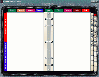
The developers seem to have beside themselves with the new ability to place tab controls whereever they wanted. Tabs are placed along the top and along both sides; undoubtedly, if they were not constrained by the size of a 640x480 screen, they would have found a reason to put tabs along the bottom as well. Of all the various sets of tabs, only those tabs along the right side of the display are appropriate in this dialog. These allow the user to quickly "move" to an appropriate page in the address book. While not easily discernible, there are two tabs along the left-hand side of the dialog; these allow the user to toggle the display between the Address Book view, and a Speed Dial view. The "tabs" along the top are particularly deserving of attention. Of the nine "tabs", only two, Add and Change, can be argued to cause a different tab to be displayed. "Change" causes the currently selected record to be displayed in the "notebook" area of the display, and "Add" causes a blank record to be displayed in the area. The other seven "tabs" are actually command buttons, each either causing a secondary dialog to be displayed, or initiate an immediate action. This is the kind of design that gives tabbed dialogs a bad reputation. |
With the release of Windows 95, Microsoft introduced what they considered a new type of tabbed dialog: the Properties Dialog. Each object in the operating system, such as a file, folder, printer, or disk drive, has an associated Properties Dialog which describes various information and characteristics of that object. The information in these dialogs always presented through the use of tabs, and very often, through a single tab:

Tabs are used to provide a conceptual categorization of the information contained on the dialog. A dialog consisting of a single tab is the GUI equivalent of the phrase, "1 record(s) found.". The single tab implies that other categories exist when in fact they do not. The tab does not provide any useful information to the user, it just takes up space and adds visual noise to the dialog. Microsoft maintains that tabs should always be used for these dialogs, even when there is a single tab. The rationale is that the tab makes it clear to the user that he or she is viewing properties and not a regular dialog box. This argument is hogwash. The very use of the word "Properties" in the command used to display the dialog, together with the use of the word "Properties" in the title of the dialog should be sufficient to make it clear to the user that he or she is viewing properties. Moreover, users do not make distinctions between "Property Dialogs" and "standard" dialogs. The typical user, upon seeing a dialog with tabs across the top sees "a window with tabs in it". Despite the user interface intentions expressed in their position, the argument in favor of single-tab dialogs is an after the fact rationalization to support the consequences of an underlying programming model. The Properties Dialogs are based on functions built into the operating system that allow developers to programmatically define the tabs to be displayed in the Properties Dialog. As shown in the image below, the properties information for certain objects may only require a single tab, whereas other objects may require additional tabs.  The functions allow developers to display up to 24 tabs in the dialog (if anyone ever sees such a dialog, please send along a screen print!). The technique is described in a number of Microsoft publications, including Creating a Property Sheet, available on the Microsoft Developer Network. Programmatically, it's an elegant technique, providing a mechanism by which developers can extend the default behavior of the operating system. The problem however, is that the model is based on a single tab, and the appearance of the single tab leads other developers to conclude that a single tab dialog is perfectly acceptable. It is not, and any attempt to justify such dialogs on a user interface basis is at best insincere. |
The influence of the Property Sheet programmatic model can be clearly seen in this illustration of the Options dialog in ClipTrakker, from Silicon Prairie Software:
 The term "Property Sheet" is a programmatic term that is meaningless to the user. It is especially meaningless when one considers that access to this dialog is provided by a menu item with the label "Options". Further, since the Property Sheet programmatic model states that property sheets have tabs, the developers of ClipTrakker provided a tab, despite the obvious fact that such a tab is unnecessary. In this case, the tab structure should be removed from the dialog, and the title should be changed to "Options". |
The installation program for Lotus ScreenCam demonstrates the absurdity of single-tab tabbed dialogs:
 The developer thoughtfully provided an instruction to assist the user. Unfortunately, since the dialog contains only a single tab, the instruction only serves to confuse the user. Given the often bizarre interface rules employed in other Lotus applications, one could reasonably expect that some users would interpret the instruction as meaning that they must first click on the tab itself before changes could be made. |
| Visual Portfolio Manager is a client management system for attorneys. The application presents a number of problems related to their use of the tab metaphor: |

|
|
Specifically, the main purpose of tabs in the application is to provide access to collections of buttons (a menu of sorts) of system functions. For the most part, the tabs serve as menus, each containing a number of submenu items. Further, this design is not consistent. Mixed in among the menu tabs are option-like dialogs and function dialogs (e.g., Database Connection). Certain tabs (e.g., Backup and Utilities) represent rarely used functions, but are nonetheless given the same priority in the dialog as frequently used function. None of the tabs are related to each other, except for the fact that the designer simply put them on the same form.
Menus would have been a far more appropriate design strategy for this application. One advantage they provide over tabs is that they can be accessed through a variety of methods including short-cuts, accelerator keys, and perhaps a toolbar of frequently used functions. Don't let this happen to your applications. |
 In the Add Database function of Oracle's Personal Oracle Lite, a tabbed dialog is used to allow the user to specify the properties of a new database. Unfortunately, the design of the dialog prohibits the user from exploring the tabs of the dialog. As illustrated above, if the curious user clicks on the Settings tab, he or she is rewarded with an error message. One of the fundamental principles of graphical user interface design is that the user should be allowed to explore the interface. By performing field validation when the user leaves a field, Oracle has needlessly prevented users from exploring the dialog. The dialog should have been designed such that field validation takes place only after the user has selected the OK button. In effect, Oracle has placed a linear model on an interface that is by definition, non-linear. If a linear model indeed underlies the process of specifying a new database, then Oracle should have used a linear interface, such as a Wizard. As a side note, notice that the OK button is enabled and is the default button, even though all of the fields are empty. Can you guess what happens when the OK button is clicked? |
Labeling is certainly not a tab-specific problem, but we've come across a number of tabbed dialogs where the labeling contributes to the inefficiency of the design.
 In the Text Properties dialog in Lotus Notes 4.6, ambiguous iconic labels have been used in place of meaningful textual labels. The user will have to rely on repeated trial and error exploration of the dialogs to learn the actual meanings of the icons. The use of icons in this dialog is particularly dubious since there are no apparent real estate constraints that would have precluded the use of meaningful textual labels. If you are considering using iconic labels in your own applications, you may want to look at the "InfoBox" in Lotus Approach:  This dialog should serve as a warning to developers: The developers of this particular dialog were simply not up to the task: if they couldn't come up with an icon, they simply used a textual label instead. Thus, two types of labeling are used in the dialog: ambiguous iconic labels, and meaningful textual labels. Your own ability to interpret the various labels should clearly indicate which type should be used. A further illustration of why iconic labels should not be used is provided in this dialog from the newly redesigned Lotus Notes 5.0:  The dialog is no less puzzling than Myst. Follow along with this computer professional as he attempts to discern the meanings of the various icons (from left to right):
|
| Ed Deans provided this image from the TCP/IP configuration dialog in IBM OS/2 Warp Server for e-business (the height of the image has been reduced by one-half to reduce bandwidth): |

|
|
As Ed described the dialog: Not only does it not use the standard OS/2 tabbed dialog control, the layout is so poorly designed it's next to impossible to see at-a-glance where you are in an oversized dialog that has tabbed pages on a tabbed page! To date, this is the winner in our ongoing search for the definitive example of improperly designed tabbed dialogs. There's still time left to submit your own candidates... |
| Sean Luke sent us a number of images from the MacOS Sherlock find utility that seem to indicate that Apple just isn't all that comfortable creating tabbed dialogs: |

|
|
Where does one begin... Perhaps the most notable problem illustrated in the animation is that the size of the dialog is determined by selected tab. The resizing can be severe: as search criteria are added in the Find File tab, the height of the dialog itself increases; switching to a different tab will cause large, abrubt, and unexpected visual changes. These changes contribute to the impression that instead of a single coherent dialog, Sherlock is a collection of three distinct dialogs, thereby defeating the purpose of the use of a tabbed dialog. The titles of the tabs introduce a number of conceptual problems. The tabs "Find File" and "Find by Content" both allow the user to Find Files. The former allows the user to find files based on operating system characteristics of the file, such as name, size, creation date, and location. "Find by Content" allows the user to find files based on their content and location. These distinctions are based on the different programmatic models underlying the two types of searches, but the distinctions, like the underlying models, are lost on the typical user. To the typical user, searching for files that contain the word "model" is no different than searching for files whose name contains "model". By allowing the underlying programmatic model to dictate the separation of content from other file characteristics, the designers have greatly reduced the utility of the file searching function. Sherlock does not, for example, allow the user to search for all files whose name contains "model" that contain the phrase "programmatic model". In fact, content cannot be combined with any other file characteristic. This is a severe limitation that further underscores the lack of cohesiveness of the tabs in the dialog: despite their appearance in a single dialog, "Find Files" is a completely separate function than "Find by Content". By placing these function in a single dialog, the user is led to believe that the functions can be combined, when in fact, they cannot. By including the Search Internet tab on a dialog that is otherwise concerned with file searching, the designers have implied that the two functions are somehow related or similar. Internet search engines are based on page structure, keywords, embedded tags, and word stemming (searches for 'thought' can also return matches with 'think' and 'thinking'). File searches are based on string literal comparisons: only those files containing the exact same sequence of characters will be matched. Similarly, wildcard characters can be used in file searches, but cannot be used in Internet searches. Sherlock allows the user can restrict the file search to name or date, whereas the same restrictions are not permitted with Sherlock's Internet searches (although such criteria are permitted with many Internet search engines). Thus, Sherlock consists of three distinct functions combined into a single dialog. The designers need to find a way to combine the Find Files and Find by Content functions into a single function that is consistent with the user's expectations and which relieves the user from having to make a programmatic distinction between the two. Further, the Search Internet function should be placed in a separate application altogether. The function requires a completely different set of operators and criteria, and produces a completely different form of output. Sherlock utlizes the tab metaphor not to present conceptually-related information, but to present apples, apples, and oranges. |
| Olli Siltanen suggested Siemens' WebWasher, an advertisement filtering program for web surfing, as a good example of improper tab design: |

|
| The truly sad aspect to this design is that tab controls were developed in large part to allow designers to get a lot of information on the screen without scrolling. By having chosen the scrolling controls model, the designers of WebWasher have effectively hidden controls from the user, removed keyboard access from those controls, and require the user to use the mouse to determine what controls and options are available. |
An anonymous visitor pointed out a truly awful use of tabs on the website for the Ottawa-Carleton Real Estate Board. We've reproduced a portion of the behemoth here:
 Every individual that I have observed as he or she initially looked at the page first threw his or her head back in surprise, then tilted it left and right in an attempt to discern the labels on the tabs along the left and right. The initial surprise is undoubtedly in response to the predominant use of electric blue, or at least to its combination with purple and "Geek" green. The subsequent head tilt response is the expected result of using rotated text as labels. Once you get beyond those characteristics of the design, you may also recognize that the tabbed search dialog is itself presented within a "tabbed" page layout. |
Gilad Deneboom tipped us to the fact that GetRight, a popular downloading utility, just doesn't get it when it comes to designing tabbed dialogs.
 The above image illustrates GetRight's convoluted configuration dialog. The dialog offers a number of tabs to configure the program, one of which is labeled "Advanced". Among the variety of options on the Advanced tab, the user will discover a button labeled "More"; clicking this button causes another tabbed dialog to be displayed, entitled "More Advanced Configuration." A glance at the tabs on the More Advanced dialog reveals that the developer seems to have run out of ideas for labeling the tabs. More what? Even more what? |
Steve Brickman sent in this image from the configurations dialog of Psychedelic Screen Saver by Synthesoft:
Yes, there are 30 tabs in the dialog. Moreover, a great many of the individual tabs have arrows (shown in lower left of above image) to allow the user to navigate across the multiple "pages" contained on the tab. What an absolute nightmare! |
|
Update: The following letter from the author of the Psychedelic Screen Saver was received shortly after the above entry appeared: I'm writing to thank you for including the Psychedelic Screen Saver in your "Hall Of Shame". It (and the subsequent taunting I received from my colleagues) was just the push I needed to get off my butt and redesign the interface. I found your critiques of the poor tabbed dialogs combined with the "Hall of Fame" examples of proper UI design to be quite informative. I managed to trim down the number of tabs to just five (from 30!) using a technique modeled after your suggested solution to MultiEdit's mess. Instead of using a list box, however, I used a treeview because it better illustrates the hierarchical nature of a display setting for the screen saver. The screen saver still has *piles* of controls but I really don't see a way to limit these in a way that doesn't take power away from the user. However, even with just the existing changes, the feedback from our beta testers has been overwhelmingly positive. Not surprisingly, I've found that after using the new UI myself for a while it has become crystal clear just how poor the old one was. ;-) |
|
With due apologies to Sesame Street, I offer the following variation of one of their favorite tunes:
One of these tabs just doesn't belong... |
 |
|
Scid suggested the .exe/.dll compression program ASPack as a candidate for the Tabbed Dialogs section of the site.
Five of the six tabs work as one would expect tabs to work: click on any of these, and the dialog will switch to the appropriate page. One tab however, operates like a command button: click on the "Exit" tab and, Oops, you're staring at a blank screen. Thus, unlike the "Open File" tab, which does not open a file, or the "Compress" tab, which does not compress a file, or even the "Help" tab, which does not provide help, the "Exit" tab does what it says; it exits the application. |
© 1996-2000 Isys Information Architects Inc. All rights reserved.
Reproduction in whole or in part in any form or medium without express written permission is prohibited.
feedback@iarchitect.com
